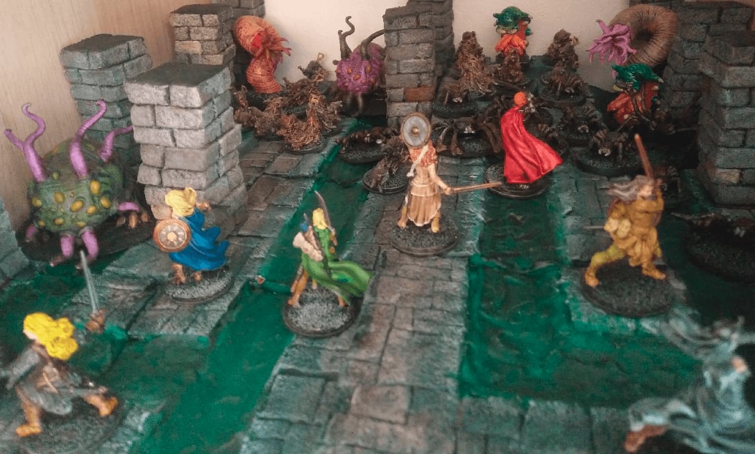
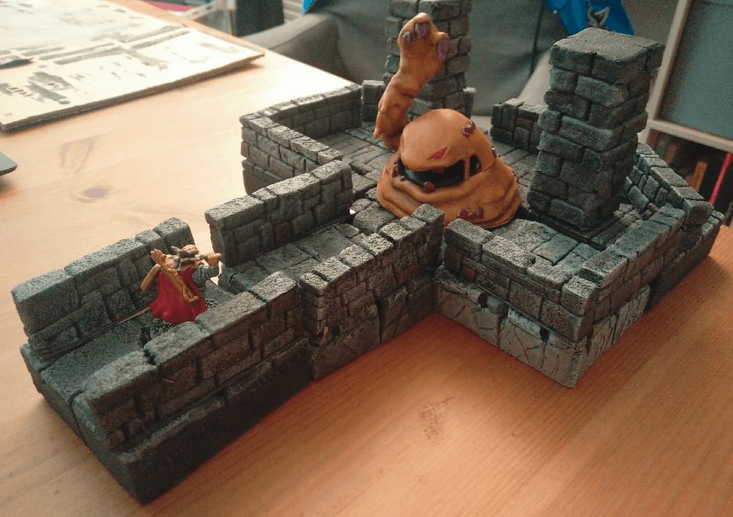
Zombicide Green Horde Tiles - Part 1

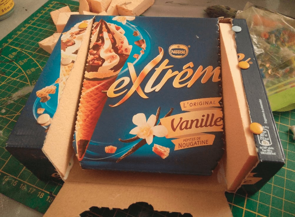
Those are four boards to play Zombicide Green Horde. I played this game a lot, so I thought I should make it even more enjoyable by building some kind of 3D terrain to play one.
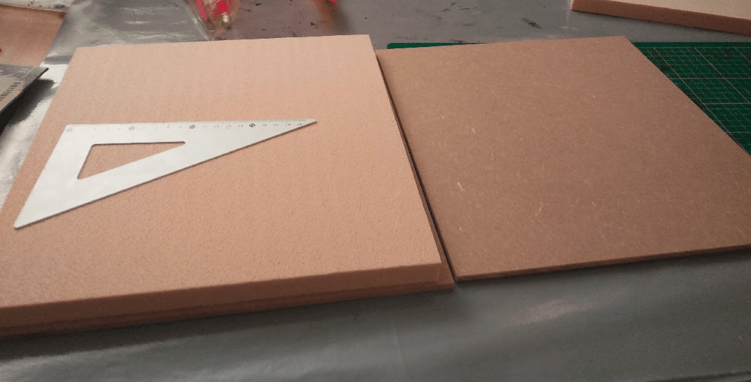
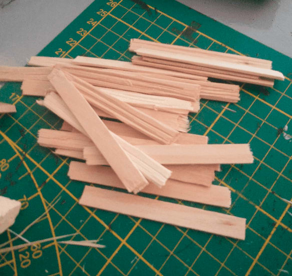
I started by ordering 4 MDF planks from my local store. I made them 33x33cm. I chose those dimensions because it means I would be able to fit them in my IKEA kallax shelves, and that would made 3 11x11cm squares per side, which should be wide enough to add details AND contain a horde of minis.
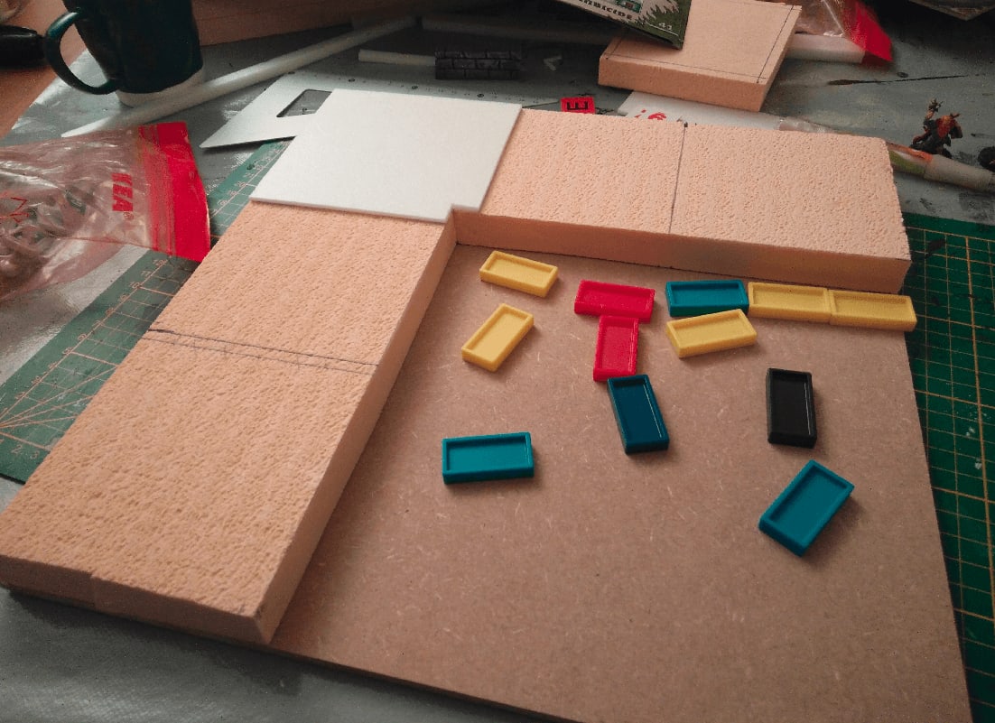
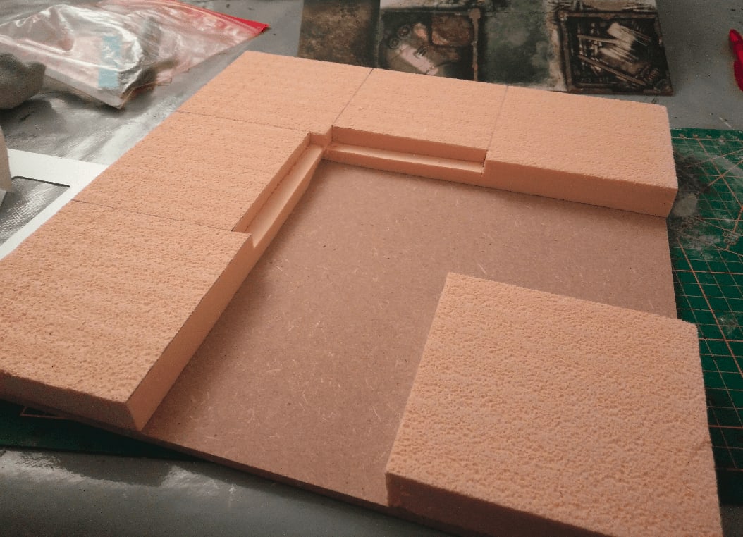
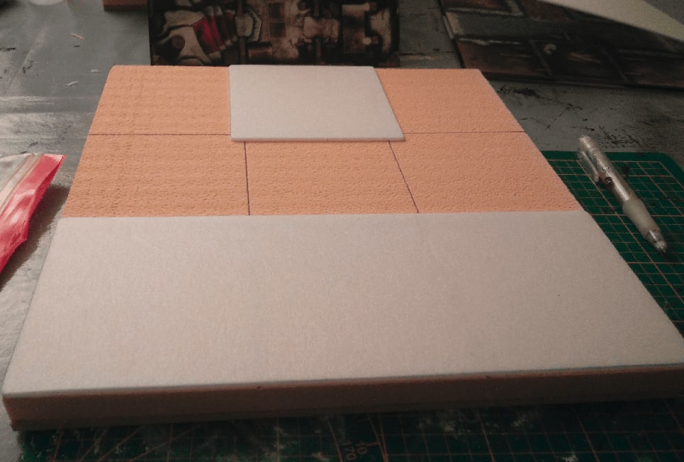
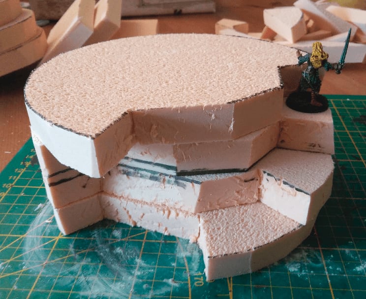
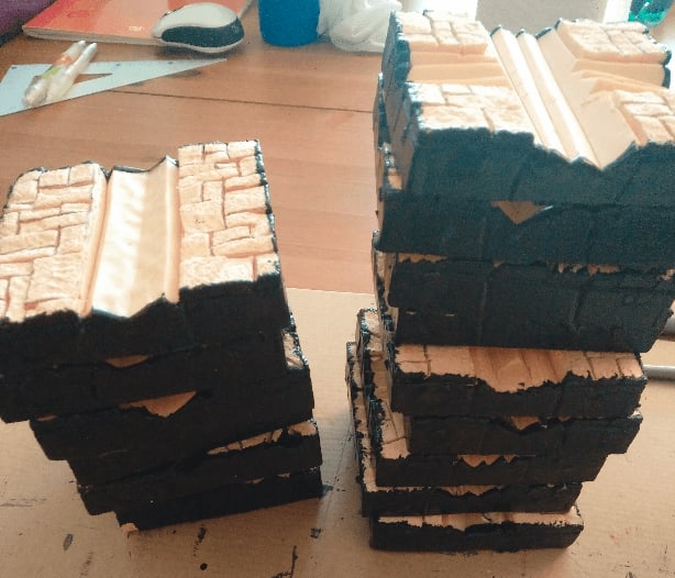
I then cut the foam to shape. In Green Horde, there is some elevation to be taken into account the rules. Some tiles are filled with water, which make moving slower, but could also prevent zombies from getting out of. I decided that anything on the MDF level would be in water, while anything on top of the foam would be at street level.
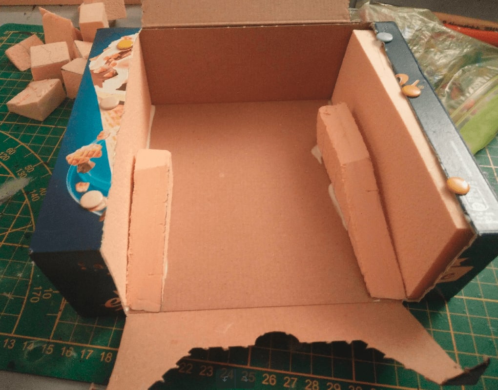
To further differenciate between street and houses, I added another thing foam layer on the tiles were a house should site. I would be able to carve this in various stone patterns to represent the sidewalks.
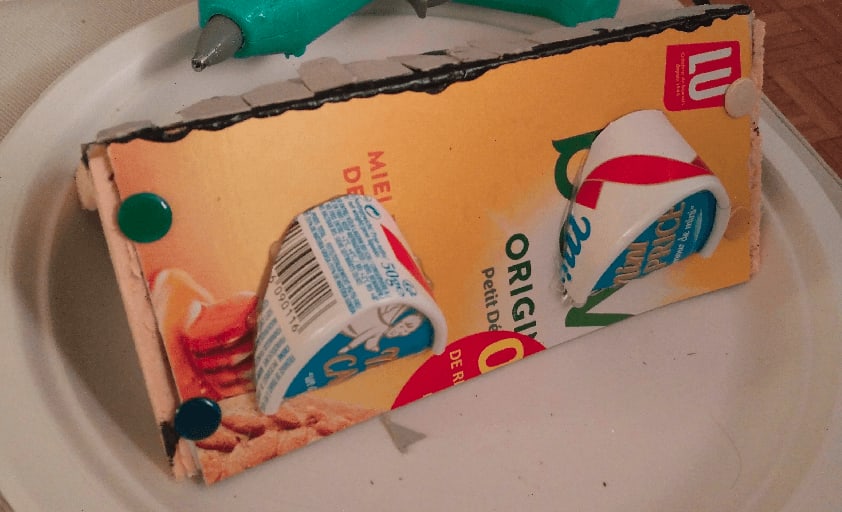
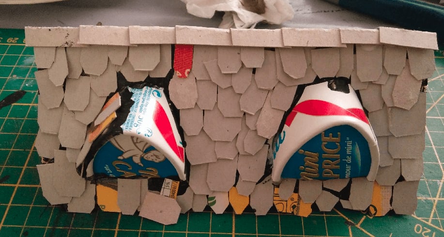
Finally, those little plastic things come from a second hand board game. The were the perfect size to glue on the side of the foam to act as stones for the canal.

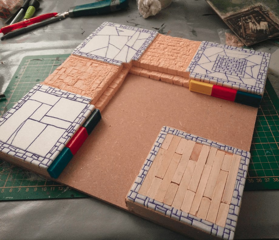
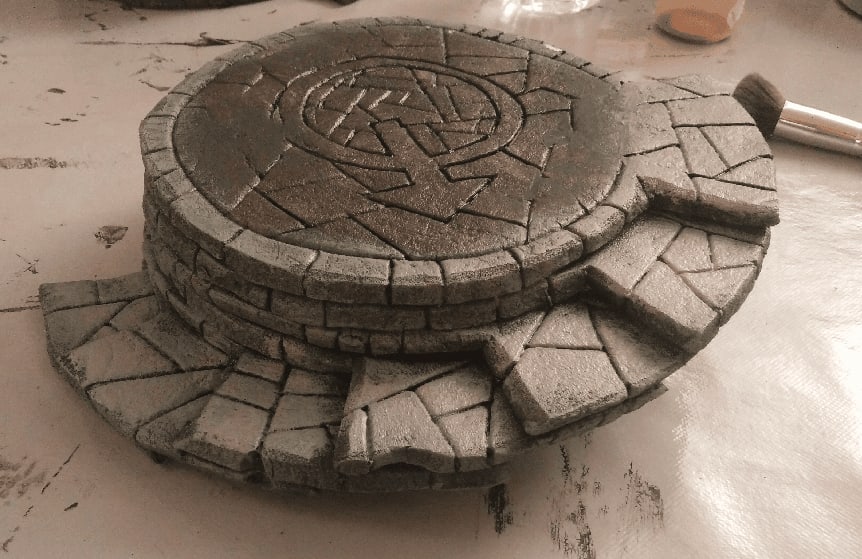
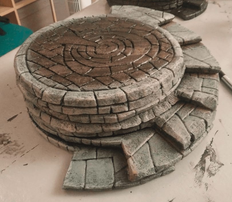
Here it is, after gluing the dominos and adding the corner tile.
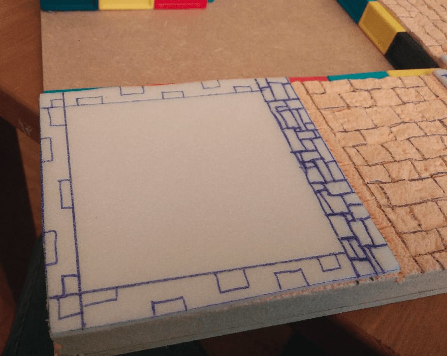
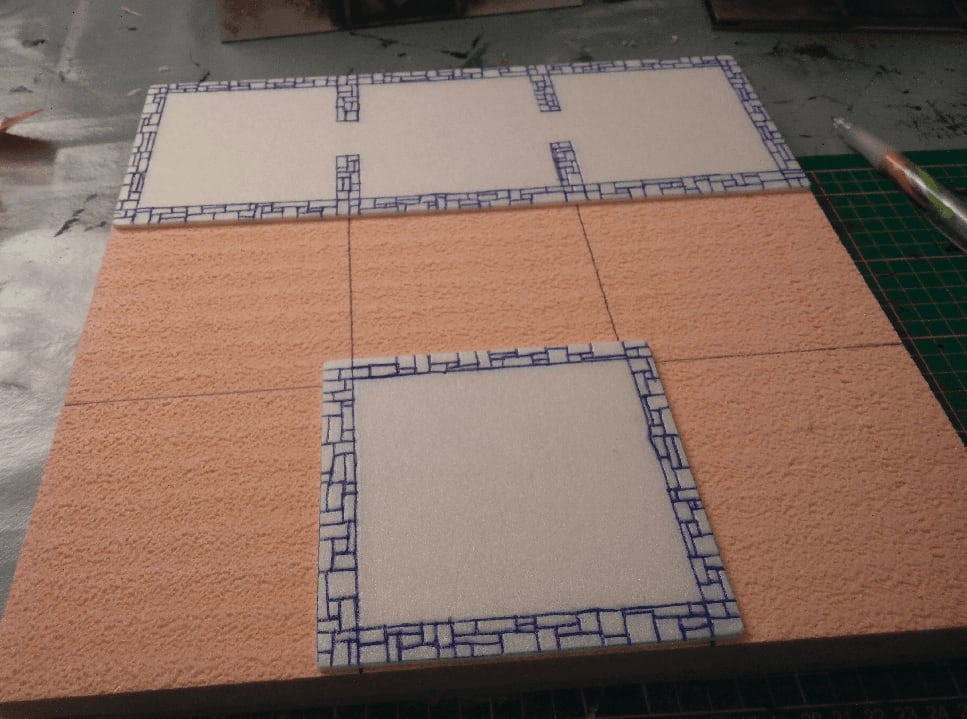
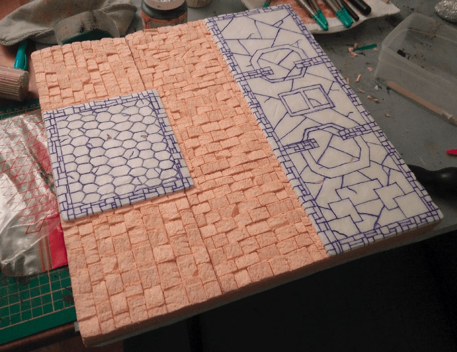
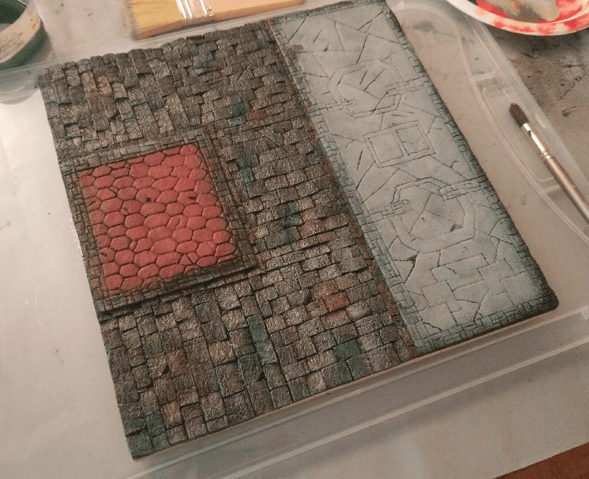
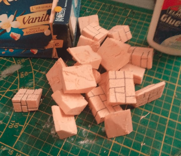
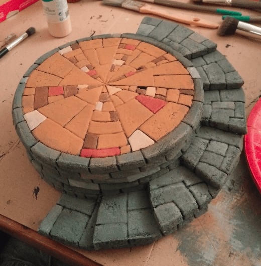
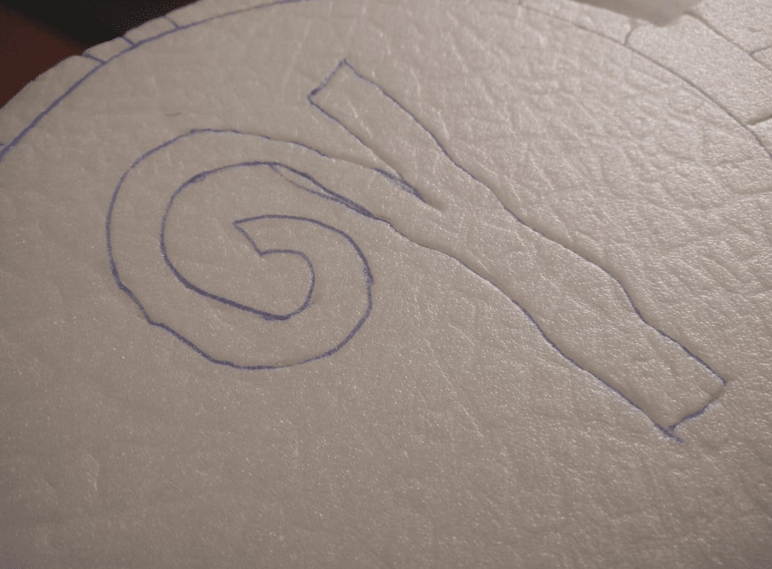
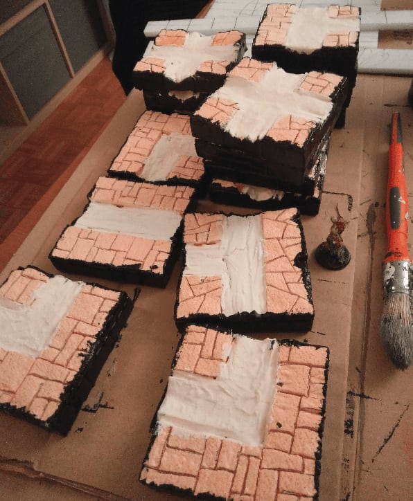
I carved some stone pattern on the sidewalk of this tile. I started with some random rectangles on each side.
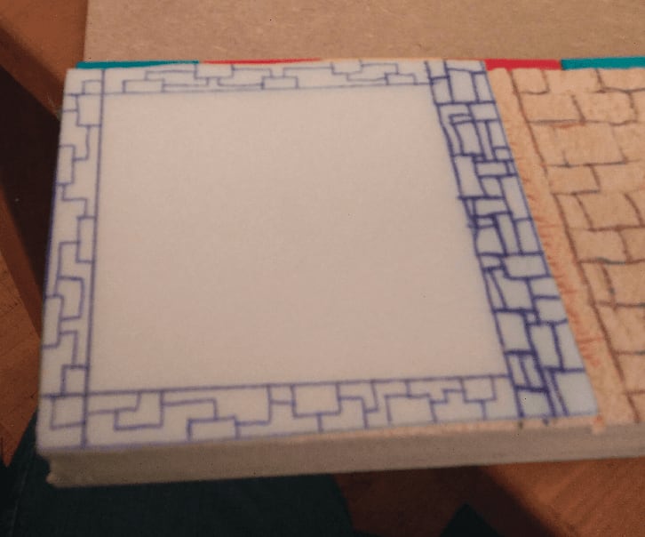
Then connected them together with more random lines turning a 90° angle here and there.
And finally connected all the lines together.

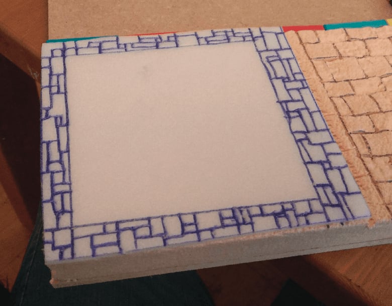
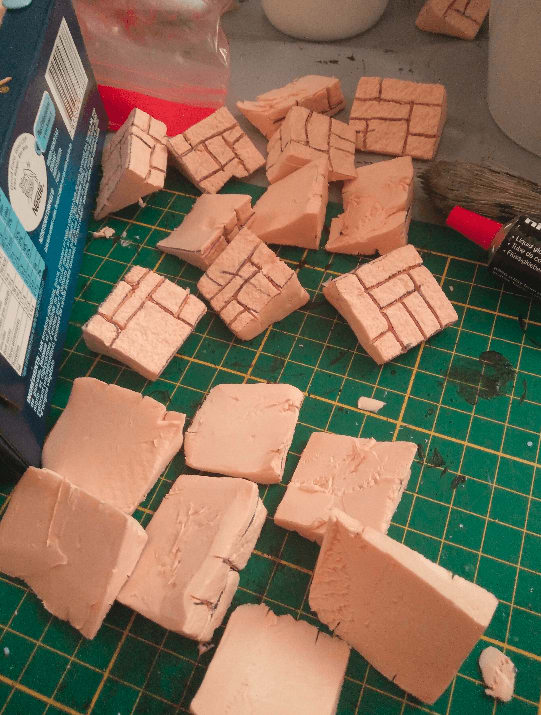
I also carved stonework for the street directly into the foam. I textured it with a rock and pressed some "stones" heavily with a spoon to indent them a bit more.
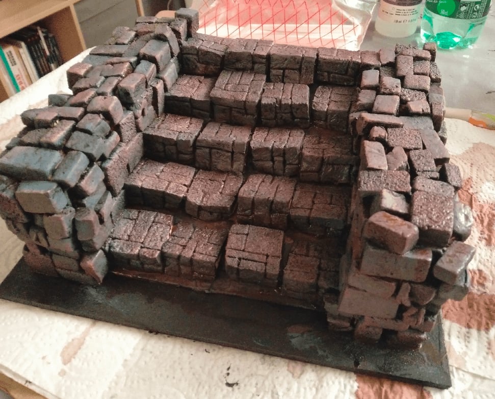
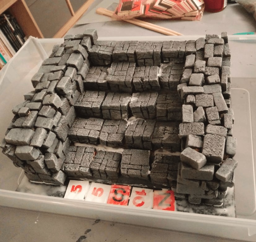
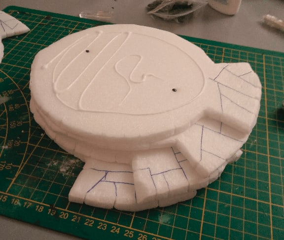
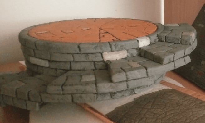
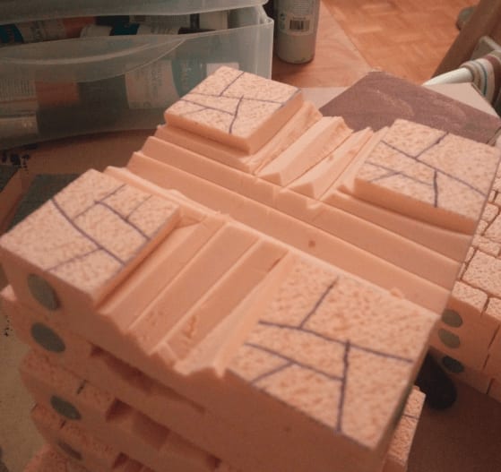
I also started working on the second tile. This one has stairs for zombies and survivors to easily get out of the water. I carved the foam at mid-height to look like a step. Minis are too large to fit on the actual step, but that's no problem as it was just meant to represent an easy way to get from water to dry land for game purposes.
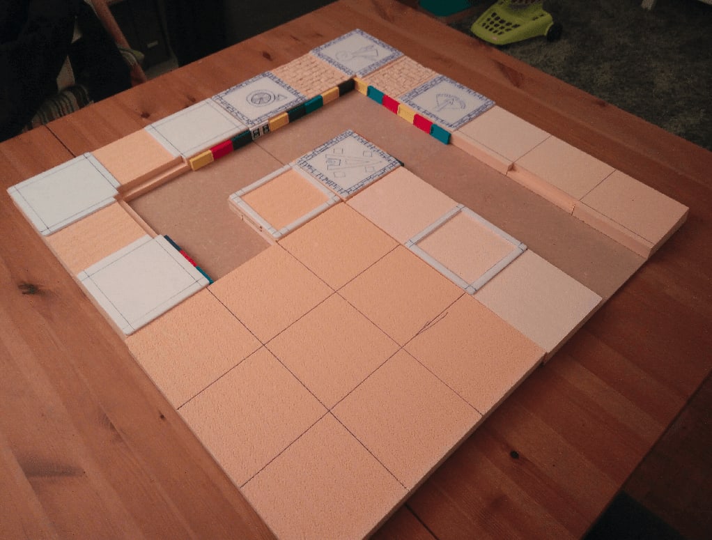
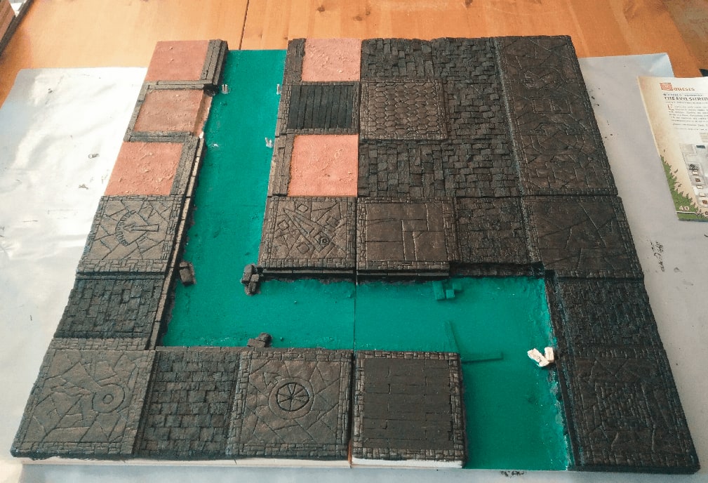
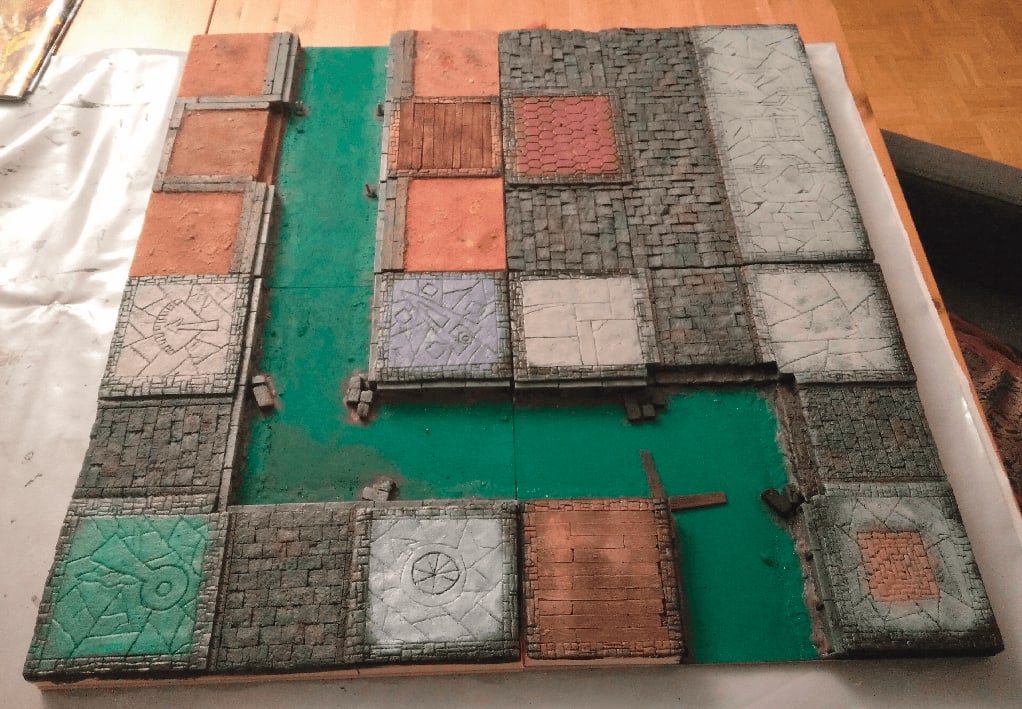
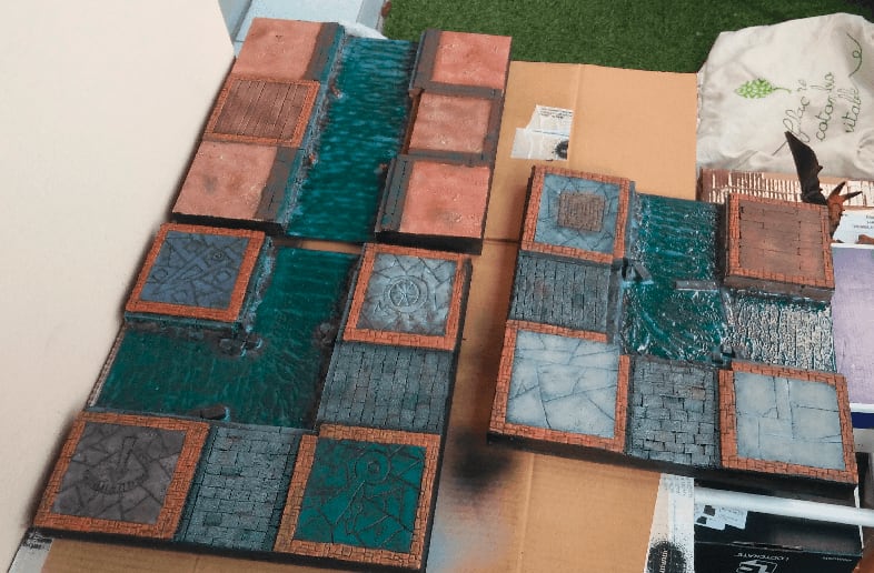
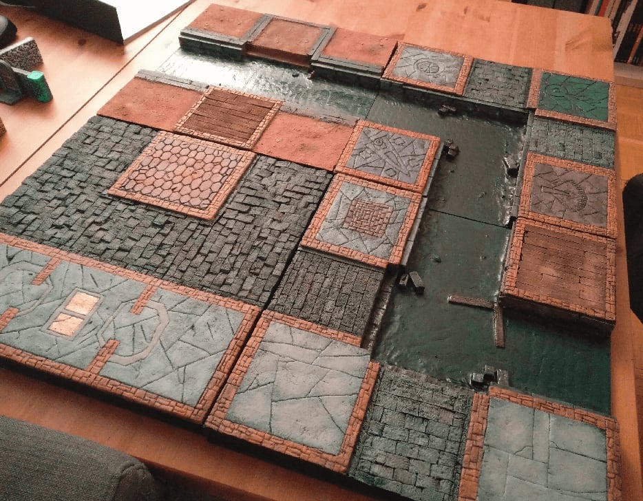
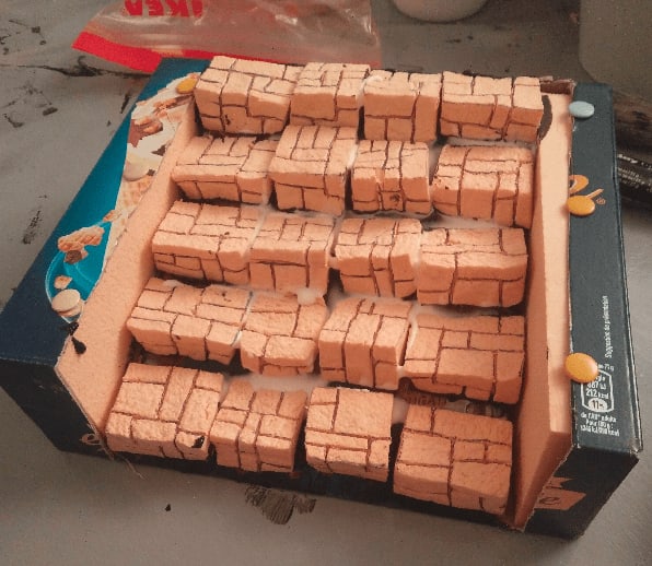
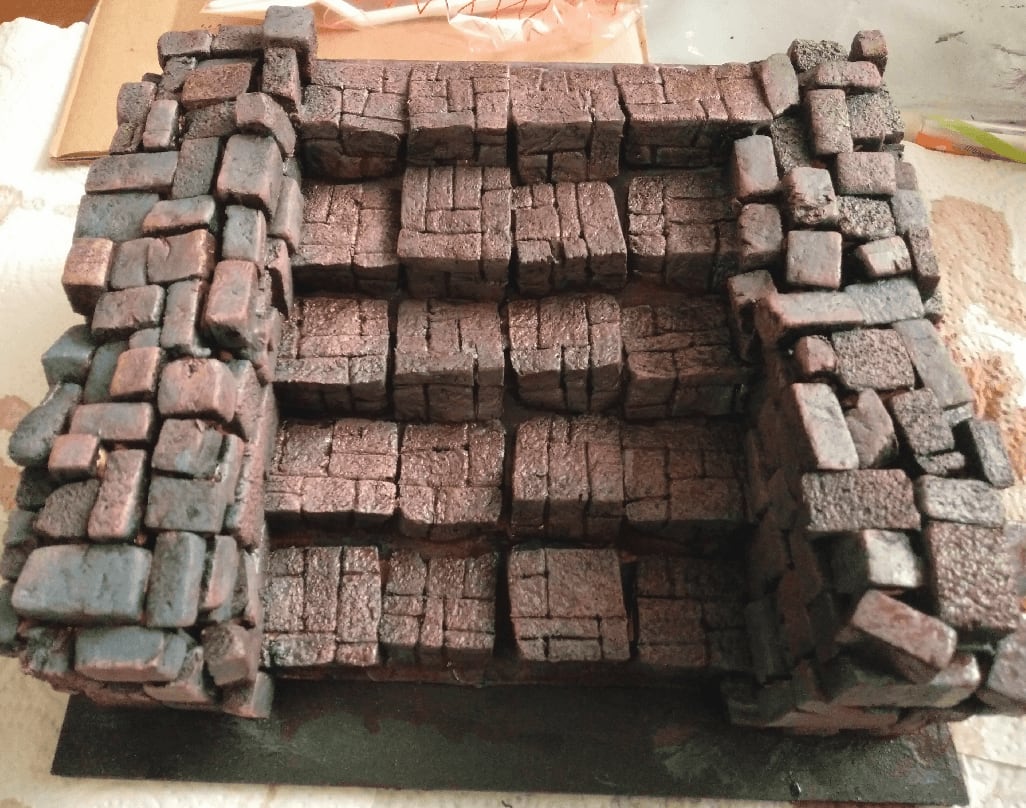
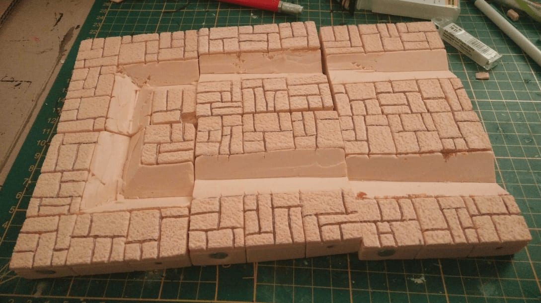
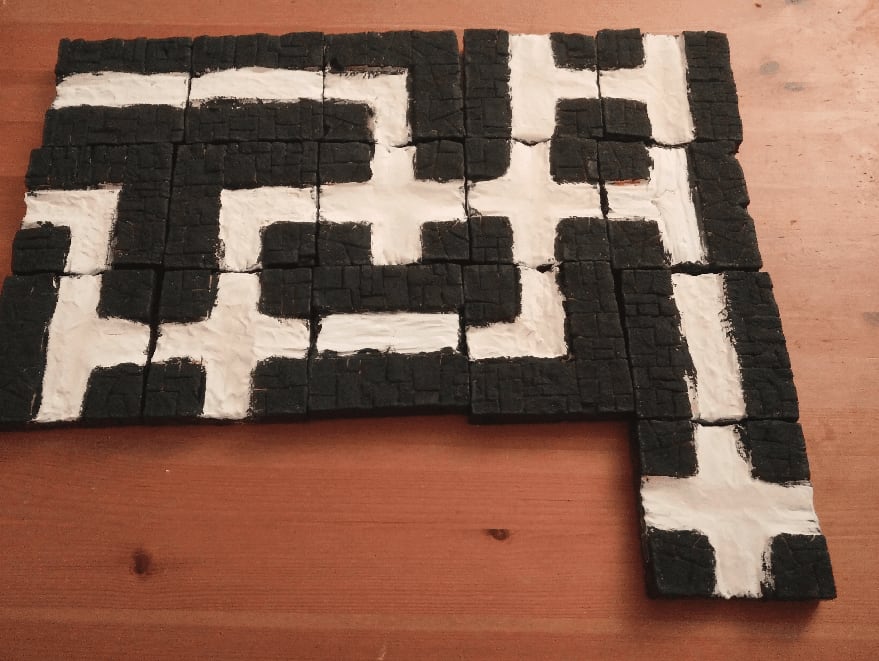
And this is the complete board of 4 tiles I was aiming for, just enough to do the tutorial scenario.
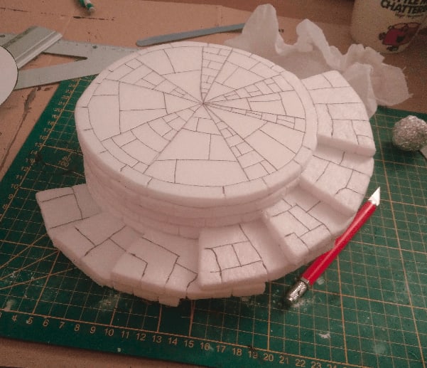
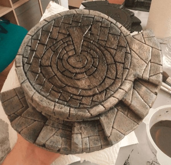
I tried to carved various stone patterns on the house floor, to better differentiate them. In retrospect, this was a lot of work for a barely noticeable effect. The patterns that work the best are the simplest; large stone slabs and no intricate details.
This tile was only streets and houses. I made the sidewalk of the center top part overflow on the adjacent tiles, to better tie them together. It looks very nice on this tile but this unfortunately prevent this board from aligning correctly with the other boards as this center top part is now larger. I didn't think of that at that time.
On the original tile, the large house is split in three rooms, so I kept this layout in the foam.
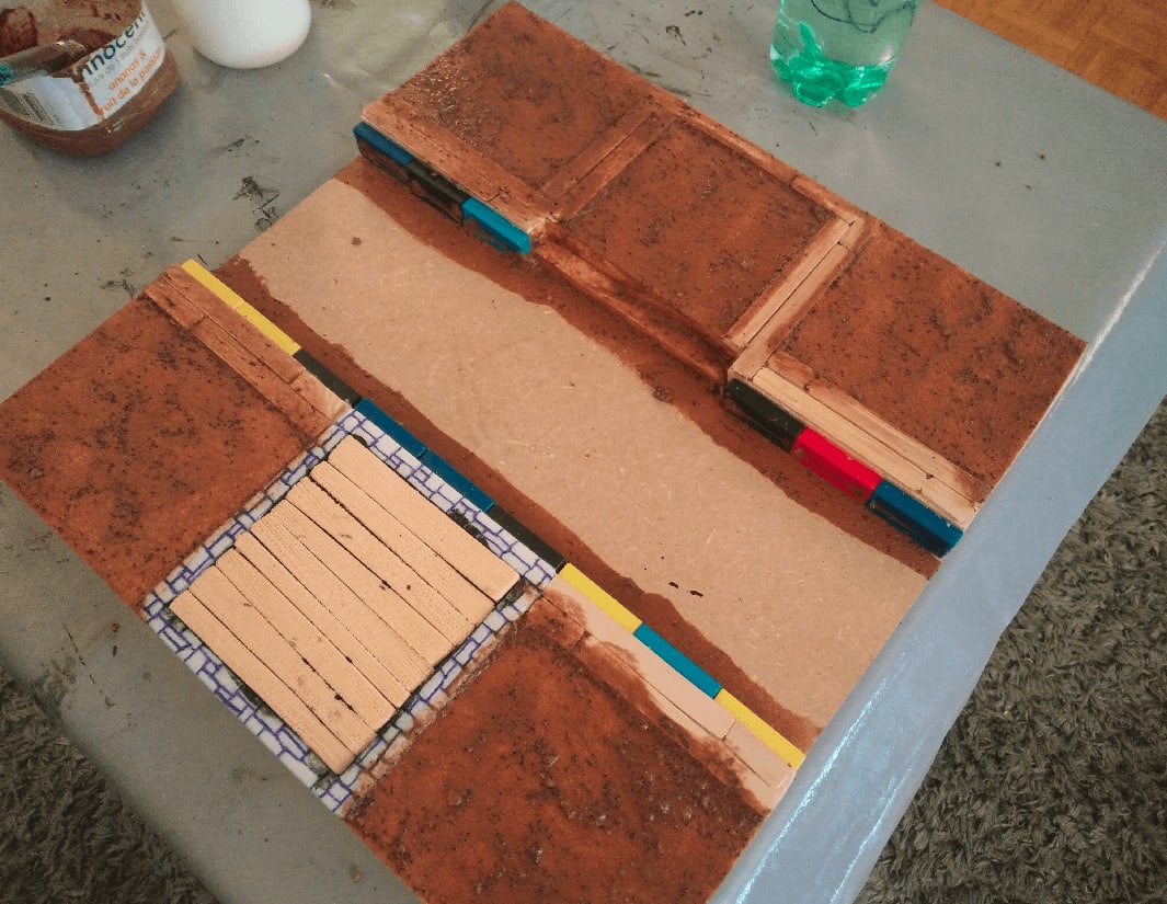
On the canal board, I started applying some texture to the ground tiles. I mixed sand, small stones, wood glue, brown paint and water and applied that.
You can also see wooden planks separating the tiles. It's because on the original board, there are hedges at those junctions. Hedges in Green Horde block line of sight, but you can still go through. My plan was to craft hedges as well (this will come in another post), but to keep the board playable without the additional hedges. So I needed a way to "mark" on the board where the edges should be. I wasn't really sure how to represent that, so I used some wooden planks. Not the best choice, but it was all I could think of.
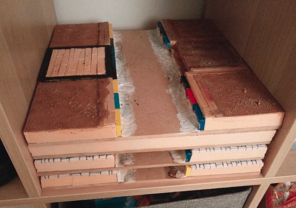
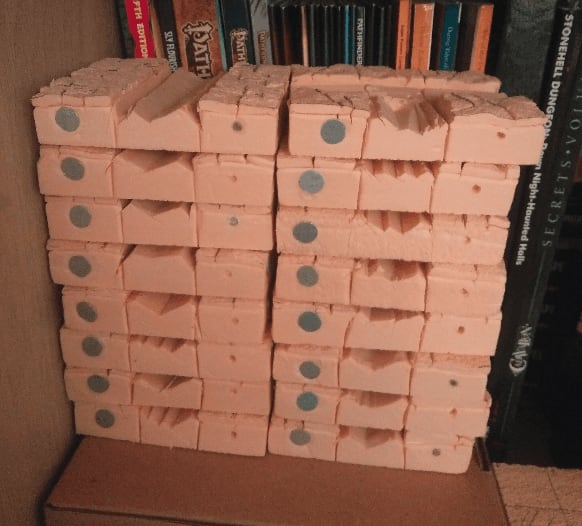
Thanks to the initial 33x33cm dimensions I took, I was able to store them in my shelf by stacking them when not working on them.
The street board. I tried to kinda replicate the initial drawings on the initial board for the long house but if I had to redo it, I wouldn't bother and would go with a simpler pattern.
I like how the street stones are looking though. I carved the foam in parallel lines, then draw perpendicular ones to form the bricks. I applied stone texture with a rock, and then pressed individual stones. Sometimes the whole stone, sometimes only part of it.
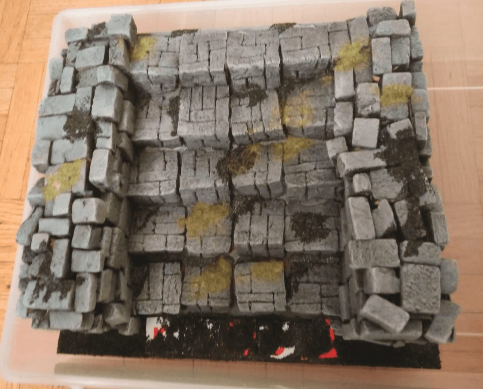
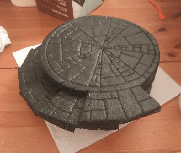
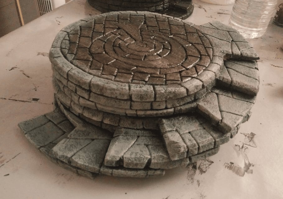
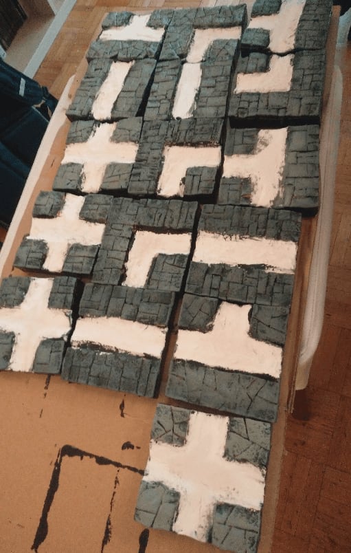
All the boards together after a first coat of paint. You can see that I added some debris in the water, to subtly mark where one tile ends and where another starts, because it will have an impact on the game.
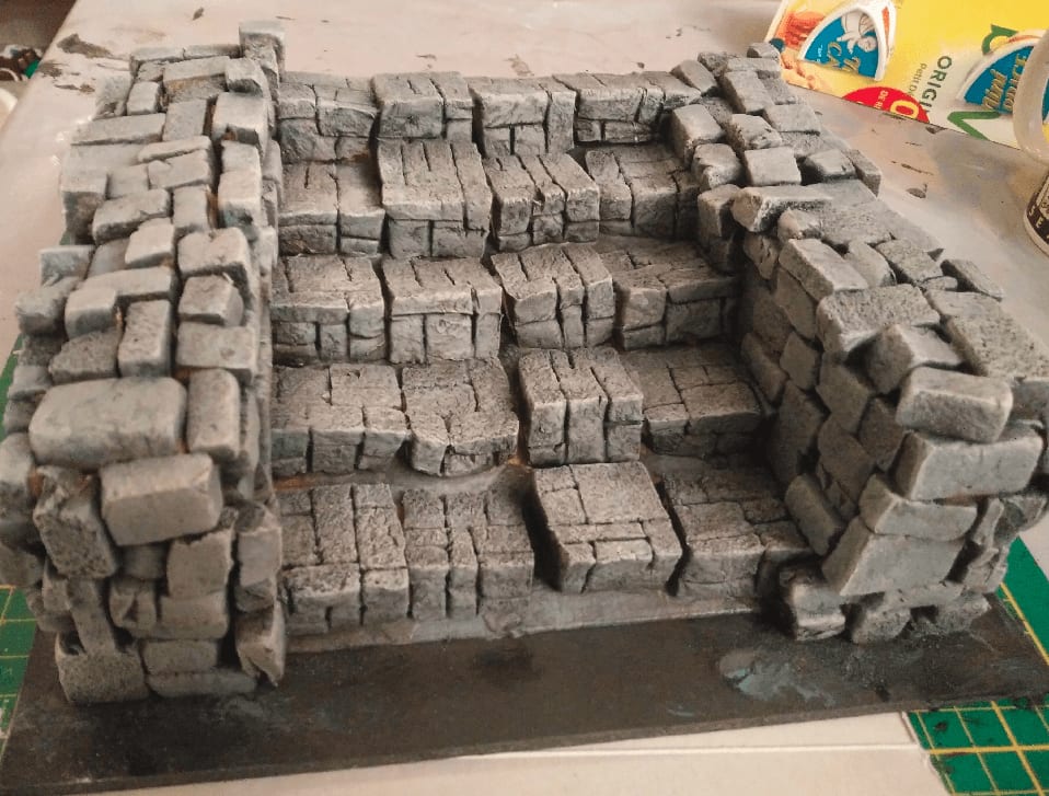
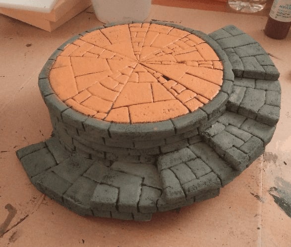
Now comes time for drybrushing. I did a gray one on the street, followed by some brown and green ones here and there. I'm not entirely convinced by the overall effect, to be honest.
After a dark wash, it looks already much better.
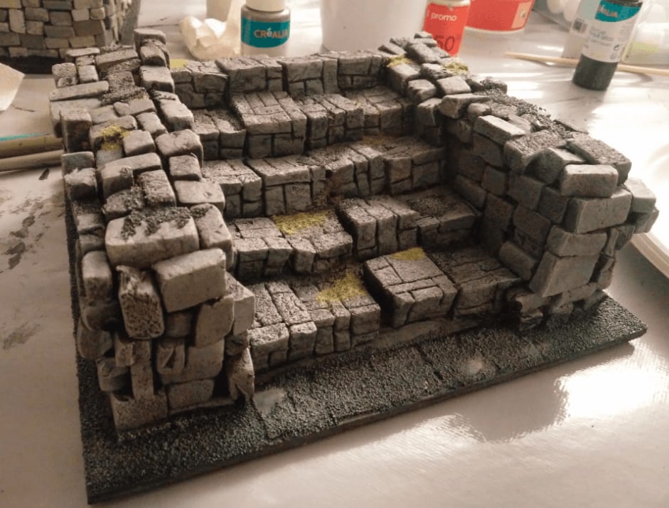
And another group shot, partly painted.
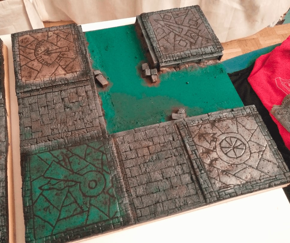
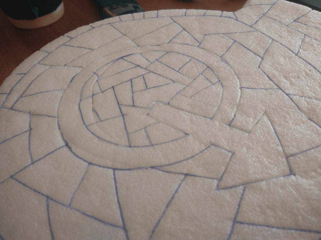
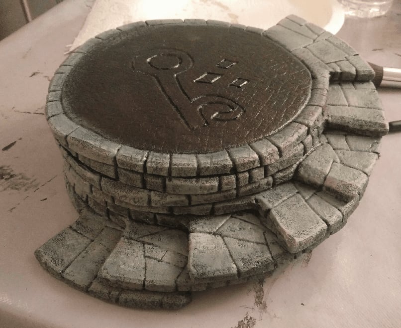
I applied a strong dark wash on the four stone floors here. I spent some time trying to carve symbols on the floor. I should have stayed with simpler patterns (I know I've been saying that a lot already, but I really should have).
More WIP shots.
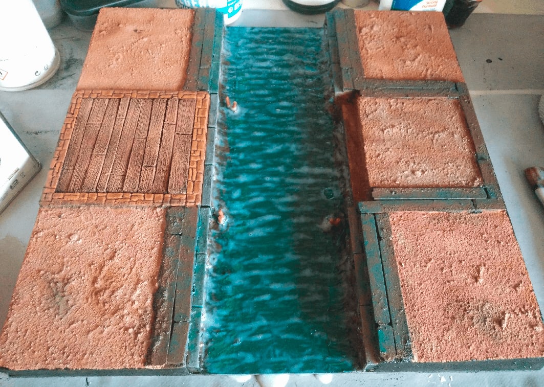
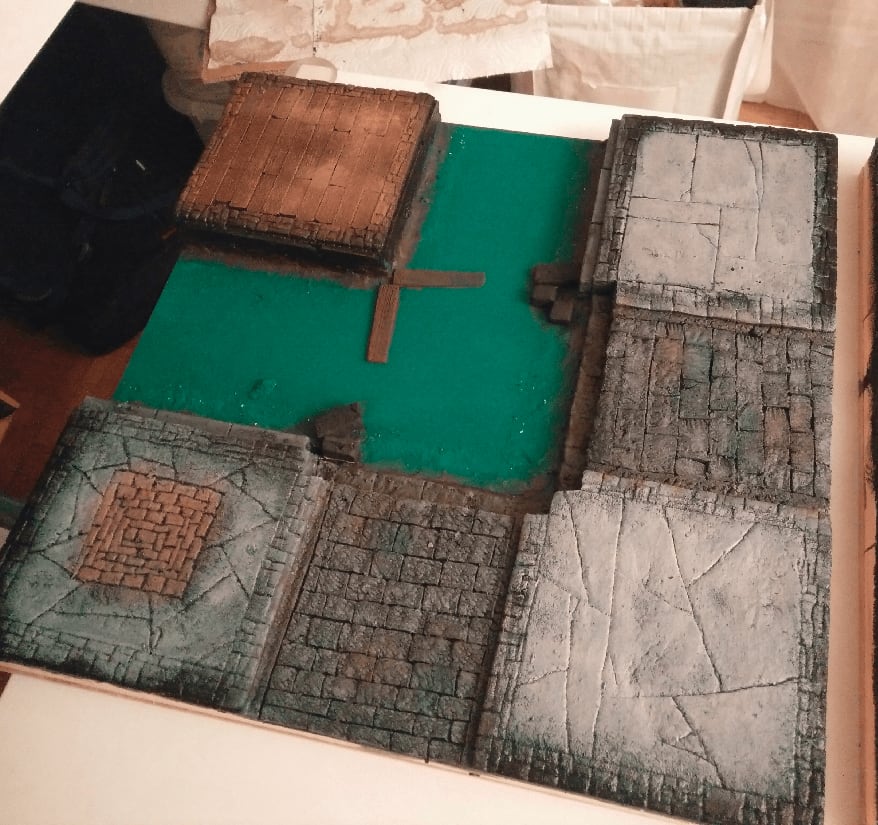
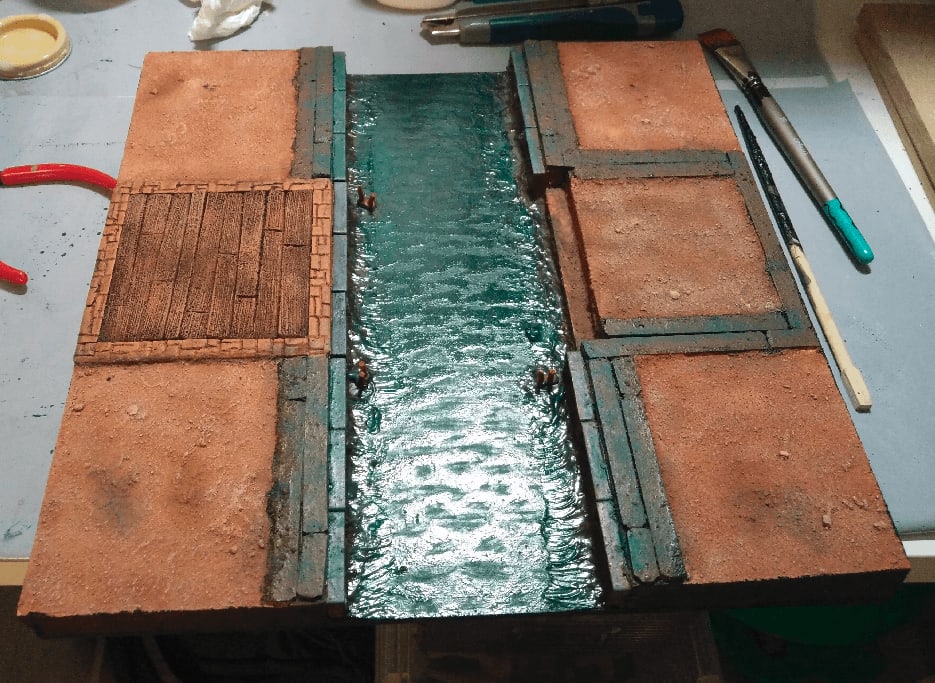
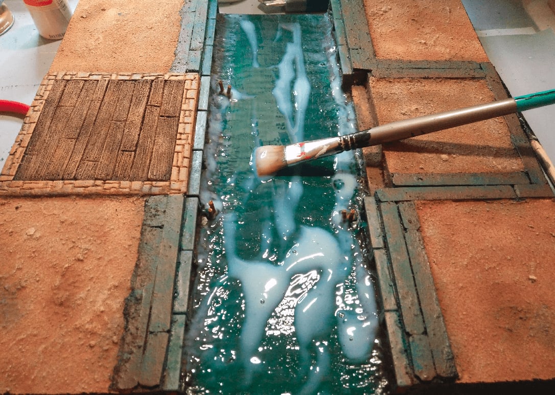
Now it was time to make this canal look more like water. I applied some translucent wood varnish on it an stippled my brush to make it look like small waves.
The effect was nice, and I let it dry overnight.
Once dry, well, it shrank a lot. All the "waves" became flat, and all the flat surfaces became dry.
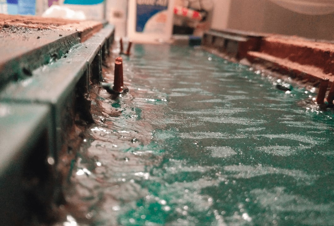
Closer shot so you can appreciate the effect.
So I applied a second layer.
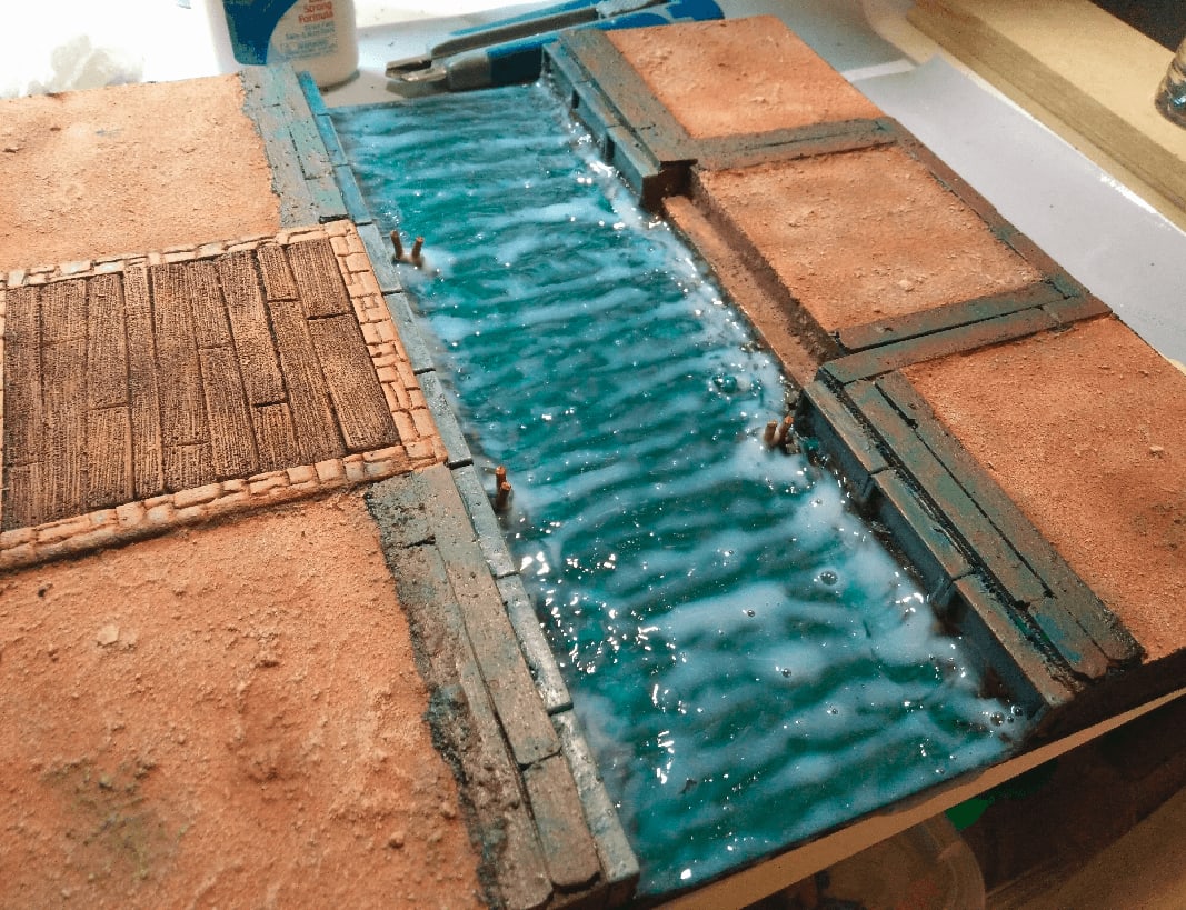
This time, I was more heavy handed. Knowing that most of it will just dry and evaporate, I added a fair amount (keeping the wavy effect).
And for sure, the final effect was much more convincing.
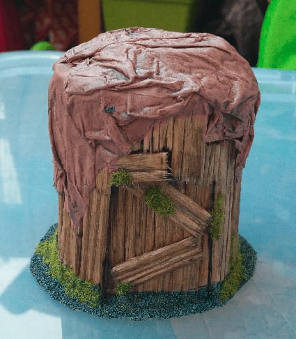
Sour Cream Shack
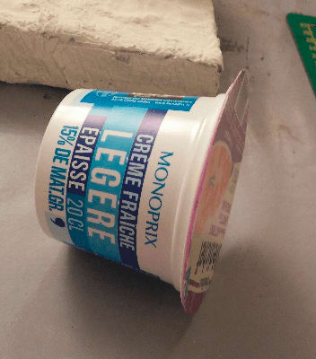
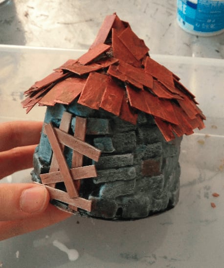
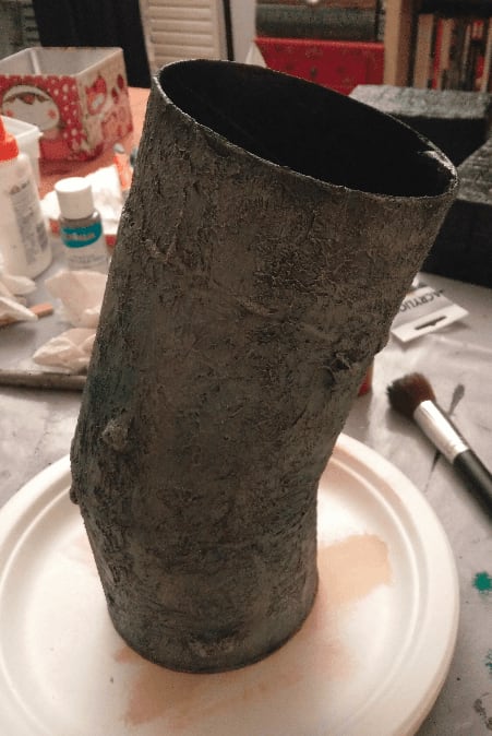
This abandoned shack was made from a Sour Cream plastic packaging.
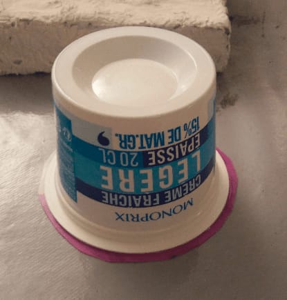
I started by gluing the packaging to a piece of solid plastic, to cover the gaping hole and act as a base.
This, is about to become a stone hut in no time.
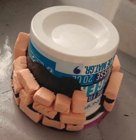
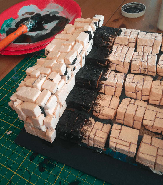
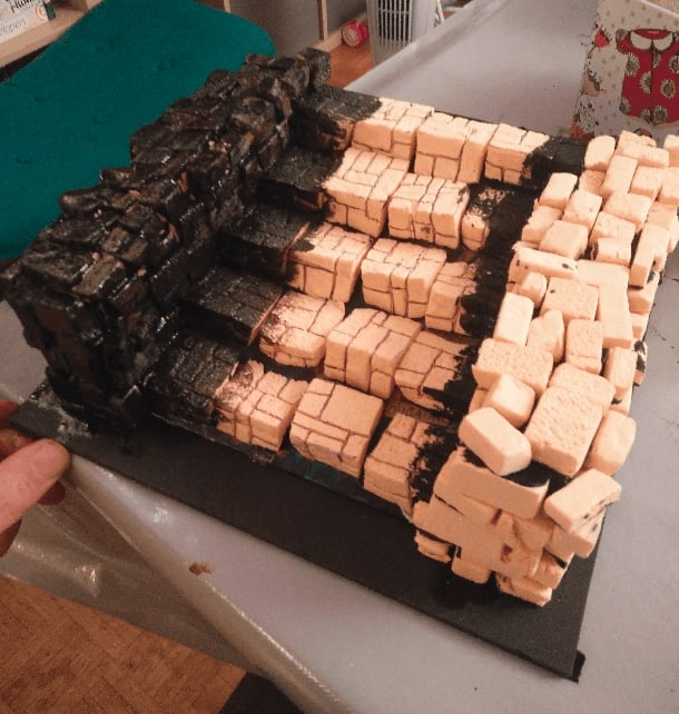
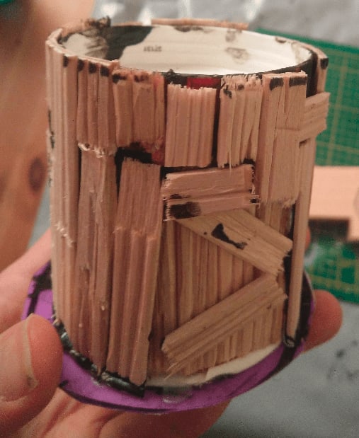
I applied black paint mixed with wood glue on the bottom part, and glued with this mixture all the bricks, layer after layer.
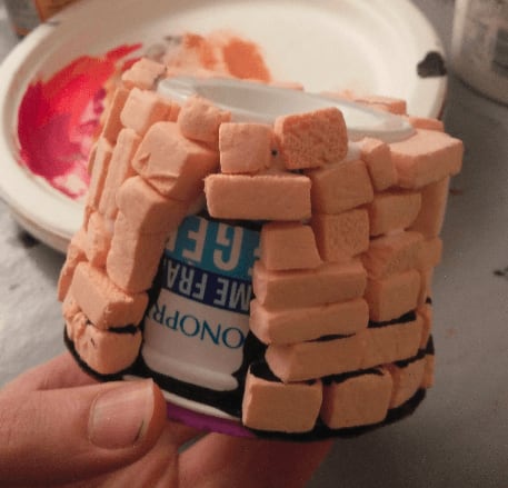
And all the way to the top. I tried to break the monotony of the layers by putting some bricks vertical, forcing me to stack them in a random manner.
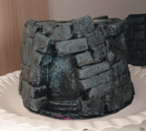
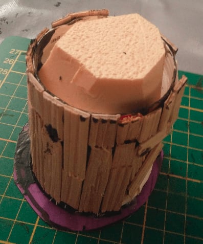
I applied diluted filling paste on it, to fill the small gaps between the bricks and act as some kind of mortar. I think there is potential in this technique, as it make the brick stacking look more realistic, but I might have been too heavy handed on the filling paste at some point because it kinda obscured the actual stones.
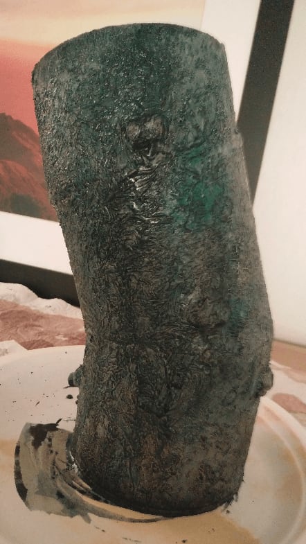
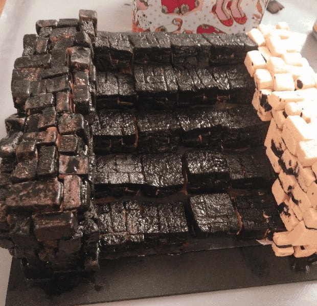
I also covered everything with black wood glue again, to act as a basecoat and varnish, and drybrushed this thing gray.
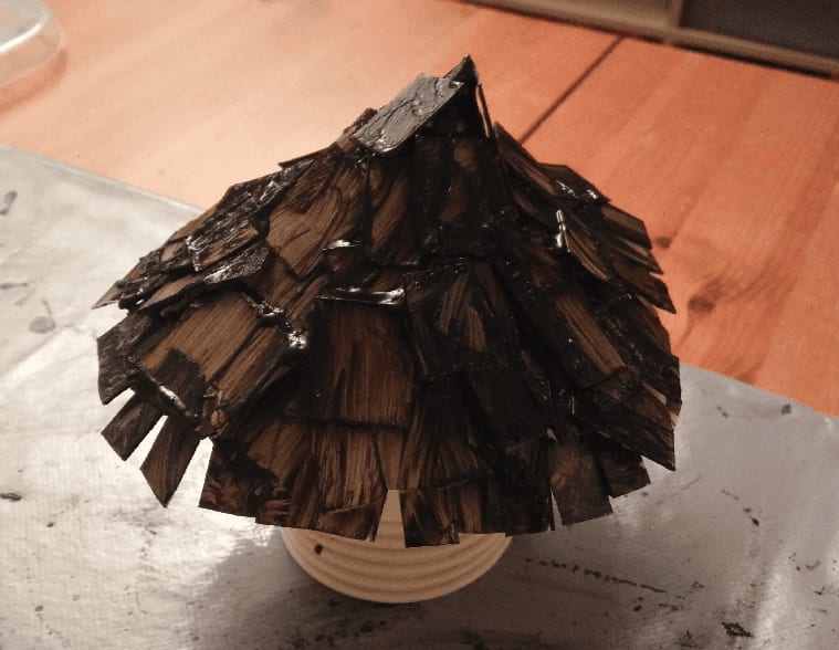
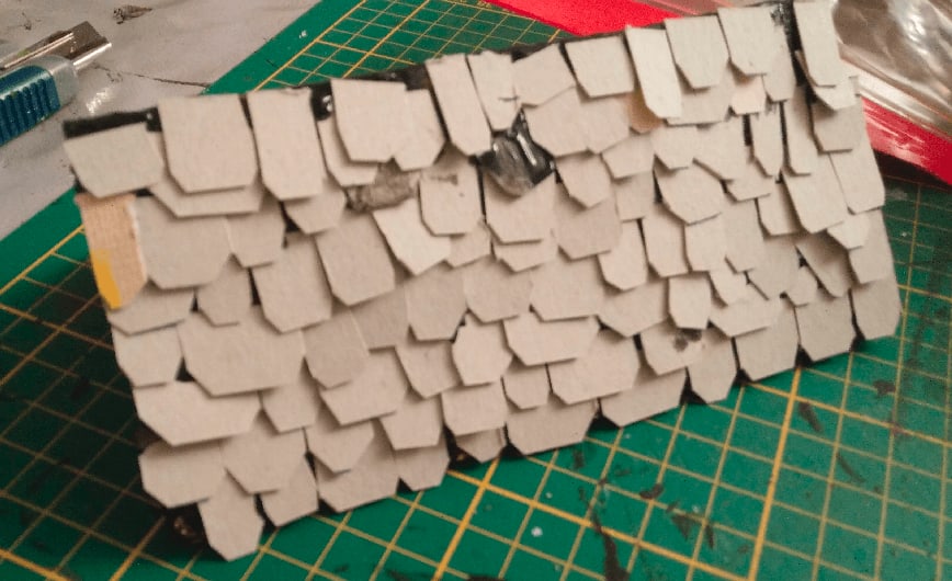
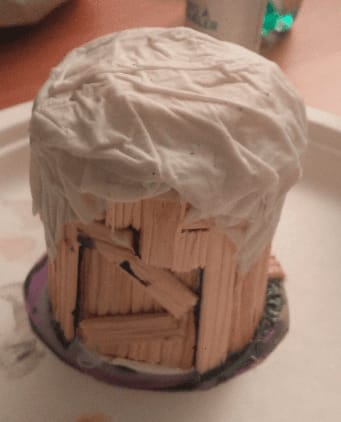
For the roof I made a conical shape out of a sheet of paper, glue squared bits of cardboard and painted it all black (with some mod podge / wood glue added for strength).
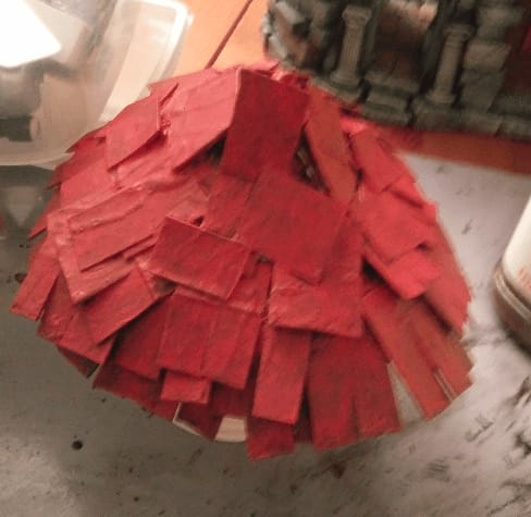
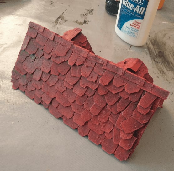
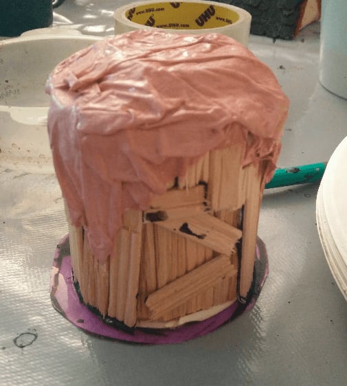
Red first coat.
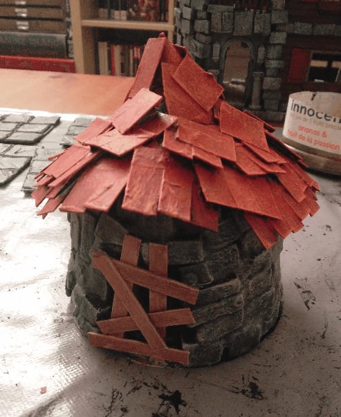
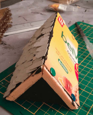
And after a second drybrush of lighter red and orange. I had no idea what to put for the door, so I decided to make this an abandoned shack with some barred door.
The door is made from coffee stirrers painted brown with a tan drybrush.
Added some dark colored washes to specific stones for breaking the monotony.
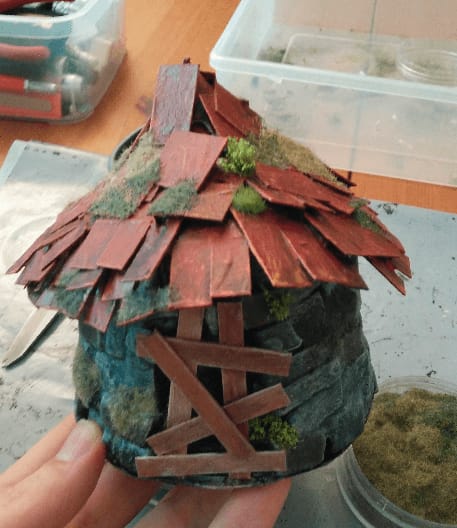
And flocking, to make it look like it has been abandoned for a long time.
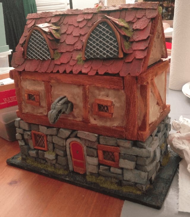
And here it stands, finished and ready for the glamor shot.
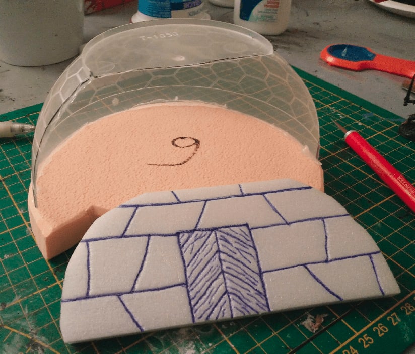
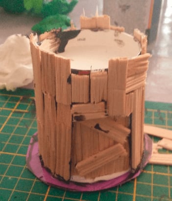
Bo Bun Bowl Observatory Tower
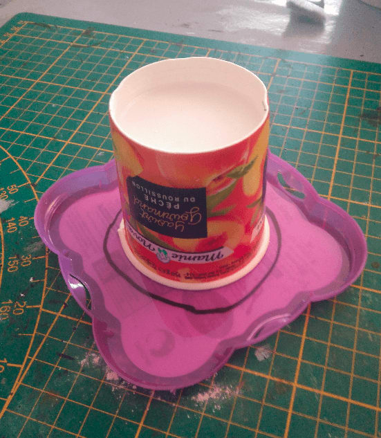
I was about to throw the plastic packaging of my Bo Bun, when I realized the shape could look like a nice dome for an astronomy tower.
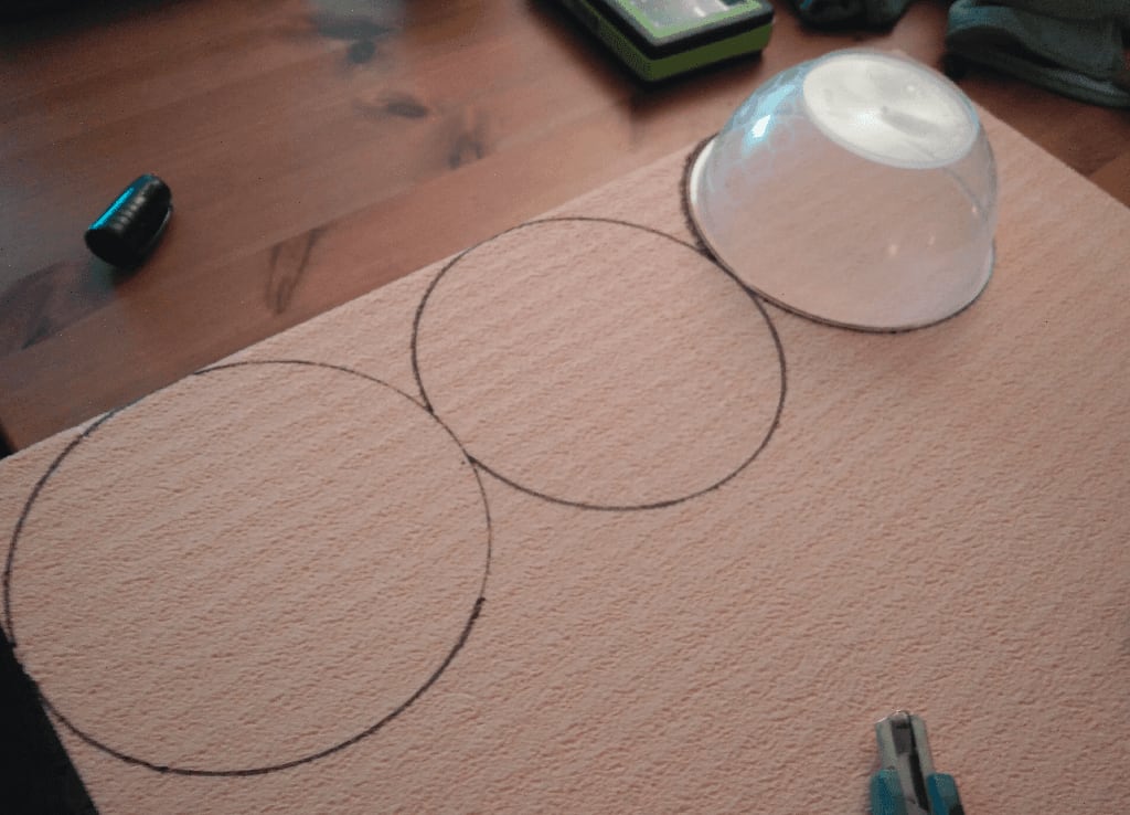
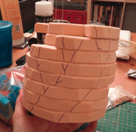
I started by drawing circles on my foam board, using the final Bo Bun bowl as a template.
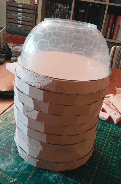
I very roughly cut the circles with my utility knife and stacked them to have an idea of the final height of the build. I was going with a used stone look so I didn't mind that my cuts were a little rough and not perfectly round.
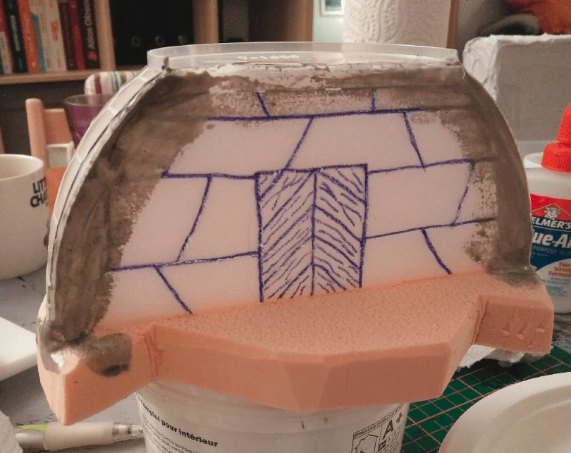
I then started carving the stair inside the tower itself. Keeping a mini handy for scale checking.
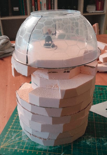
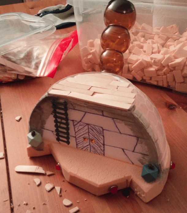
And once the whole stair was carved. I liked a lot the way it looked, but as I wanted to keep this piece playable, I decided to cut the final dome in half, to keep one side flat where I could place minis.
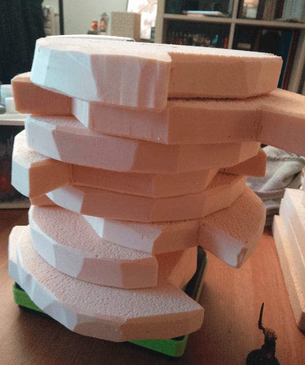
I smoothed the edges of each layer to make them look more like stone.
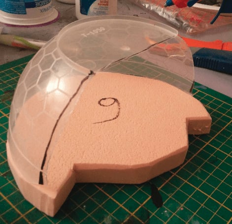
And I cut the bowl in half. The noise it made was horrible, but I finally managed to have a semi-clean cut.
I took a fine piece of foam, carved some stone texture on it, and cut it to shape to fit in the hollow bowl. I completely forgot to apply stone texture with the ball of aluminium foil at that point, damn.
I then glued it in place, and added some filling paste to cover the gaps. This is very messy. And once again I forgot to add stone texture to the floor before gluing stuff. Adding if once everything is glued is much harder.

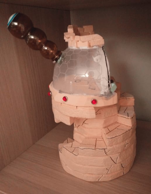
I added a bit more details to try to cover the sloppy build with distractions. The red pins and d20-like shapes I bought in a craft store. The skulls are from Mantic Games (in their awesome kickstarter for dungeon scatter furniture).
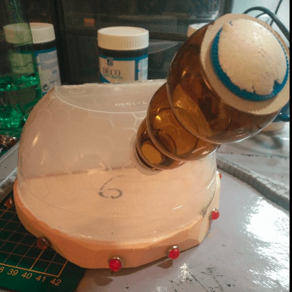
The telescope itself is a candy packaging I found in the street (I think, TBH I'm not even sure what it is)
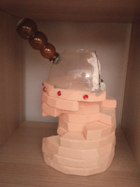
And the final piece, in its unpainted glory.
I added some wooden planks on the top floor.
And I then had the idea of adding cracks all around the tower, to give it some kind of crumbling feel.
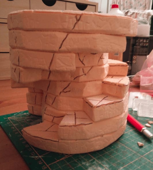
I textured it, and carved the cracks.
And added some broken bricks all at the top. From an architecture POV, this building makes absolutely no sense.
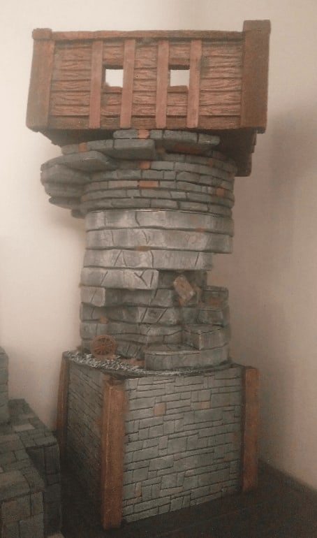
Apparently, I forgot to take more pictures of it while I was working on it, so all I have is this group shot with other projects I was working on at that time.
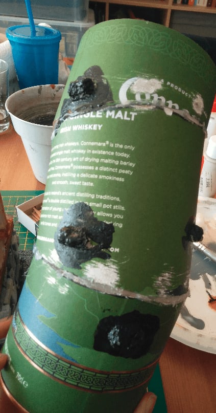
Irish Whiskey Mage Tower
This is a crooked mage tower made from a cardboard Whiskey packaging. The build is definitely not my best, but it gave me the opportunity to practice.
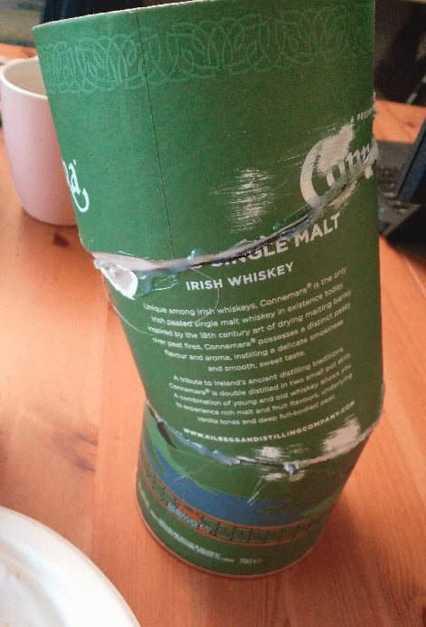
It all started with the packaging of an Irish Whiskey bottle I found. I cut it in three parts at an angle and glued the parts back, but slightly rotating them, giving them this crooked look.
I didn't want to cover the whole tower in cardboard bricks as it would have been too time consuming and instead tried to give the illusion of stone by adding only a few bricks here and there. For that I used foam bubbles (used to protect stuff during shipping) and glued them with black paint and mod podge. Those foam bubbles react to water and shrink, so I had to not apply too much glue because even the tiny amount of water in the glue made them shrink.
Here is the tower covered with those strange stones.
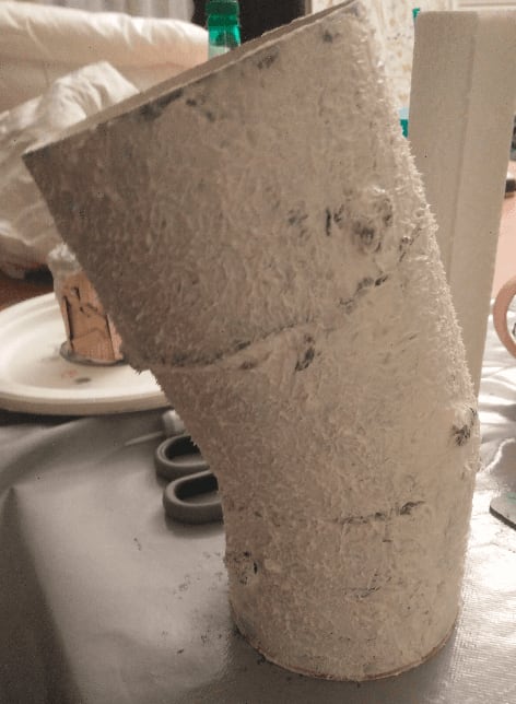
I then covered the rest of the tower with filling paste using my fingers, then with some paper towel to dab it on the paste, giving this texture effect. I let it dry overnight, and then sanded it to remove the pointy bits.
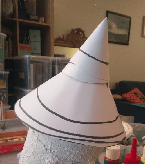
I then started working on the roof by cutting some circles in a sheet of paper, and rolling them as cones, then stacking them together; once again, to give a crooked effect to the roof.
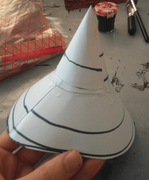
Once I found the right angle for them, I glued them in place.
Black first coat, grey drybrush and some additional brown and green drybrushes. I tried to do some variation on the otherwise uniform grey texture, but the final effect is not as realistic that what I had in mind.
Added a black wash to try to improve the overall look.
And finished it with some blue shingles and flocking. I tried to do some kind of vine with the flocking. I also realized that I totally forgot to add any doors or windows to the tower. It was a quick build, but maybe a bit too quick.
I did this build mostly to test and try techniques, without really having a plan in mind.
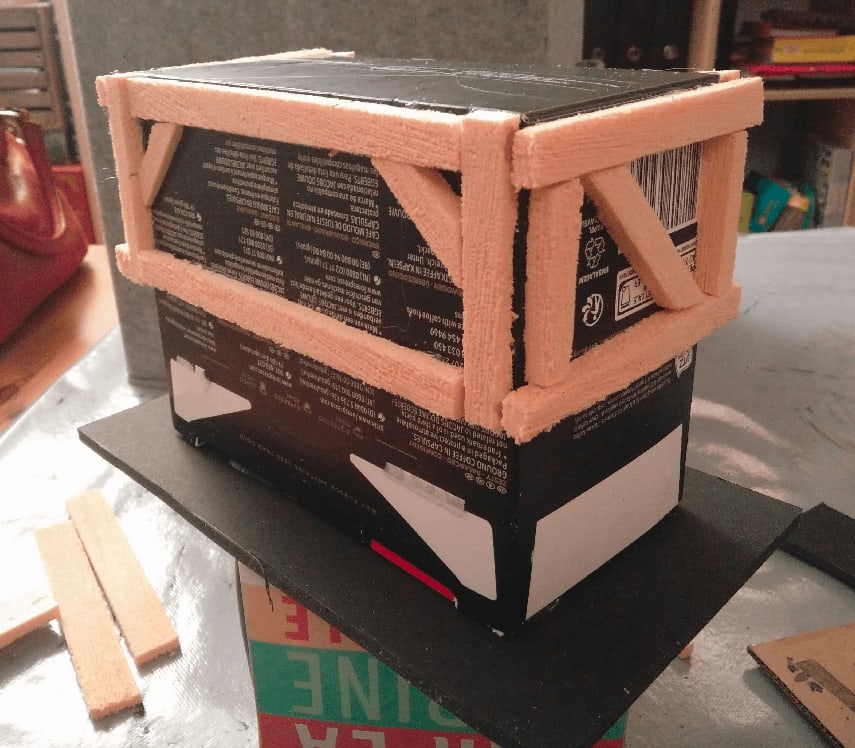
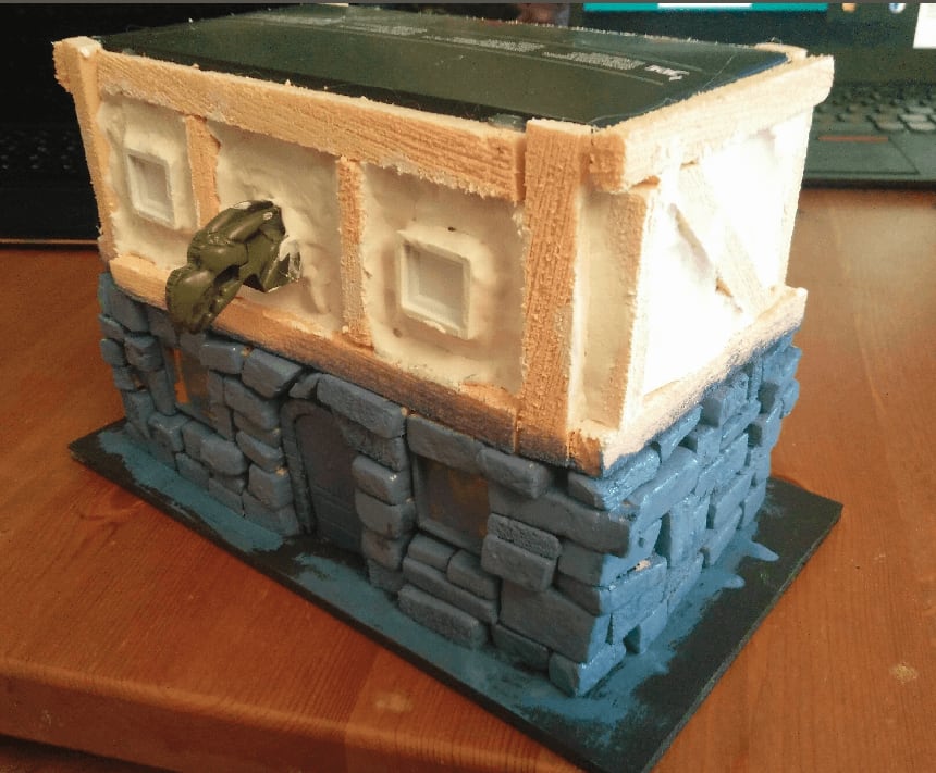
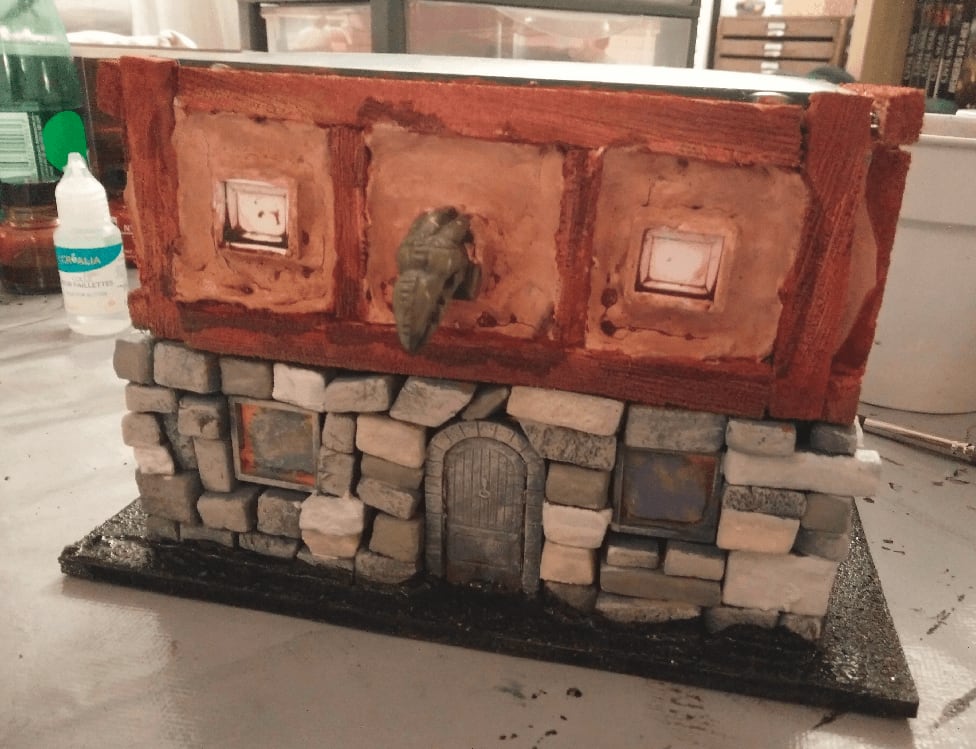
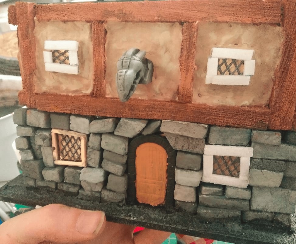
Timber house from coffee box
This is my first house build, from a coffee capsule box.
Structure
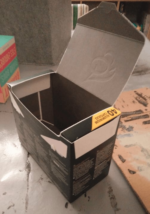
Having a nespresso machine at home, I end up with a lot of those coffee capsule boxes. Being in a crafting frenzy, I'm also always on the lookout for common household items that I could turn into terrain. Seeing the perfectly rectangular shape of those boxes, I tried to transform one into a half-timber house.
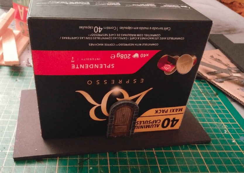
I started by gluing it to a piece of foamcore, and added a door (taken from the Zombicide board game) to give me an idea of the scale I was aiming for.
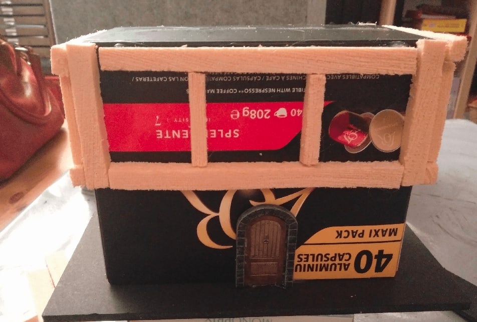
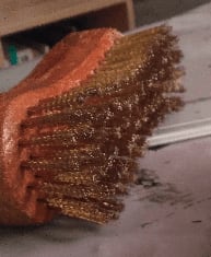
I cut strips of foam, and added wood texture by scrapping them with one of those brushes with metal bristles.
One or two passes of this on each strip gives a perfect illusion.
I then glued them to make it more or less look like a timber house.
And the back.
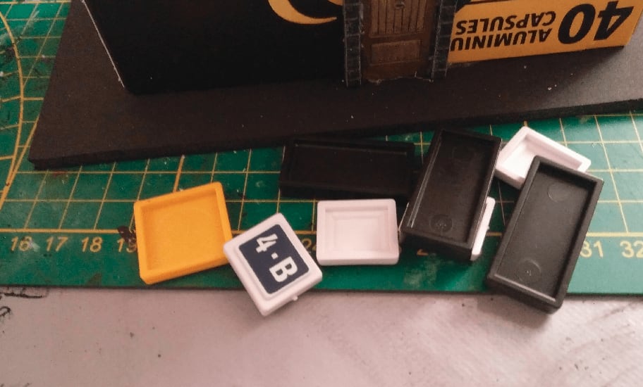
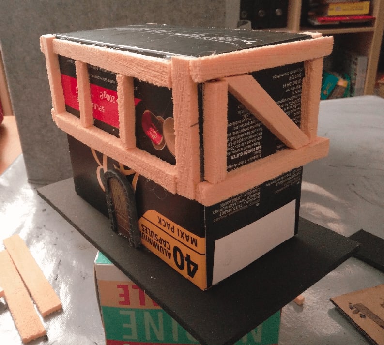
I then started to add some windows. I took those plastic things I got from old board games (scrabbles and such) I had for a few euros a bag in a garage sale.
I glued them on the house where I wanted to have the windows. This would make adding the bricks and texture around them much easier that trying to fit a window afterward.
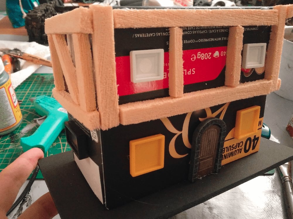
I added bricks on the ground floor. I used my mix of black paint and mod podge as glue. I dipped each brick in it on one side, then added the brick to the wall, with the glue-covered side facing the wall. This was a bit fiddly and took some time to dry.
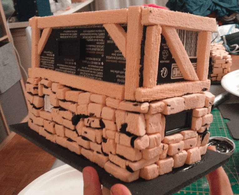
But, as expected, I was able to cleanly add bricks around the windows.
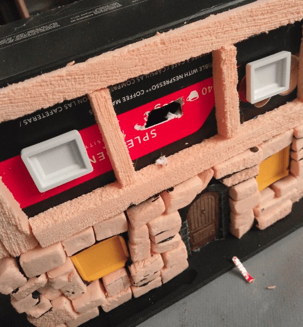
To give more style to the facade, I decided to add some kind of statue there. Architecturally, it doesn't make much sense as it will be some stone protruding from a half-timber house.
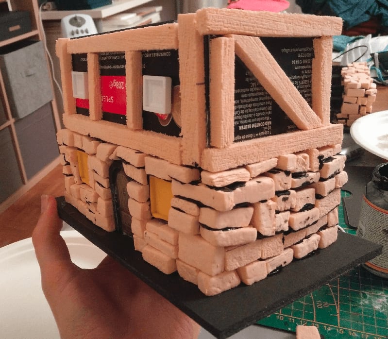
Here it is, after applying the plaster (filling paste).
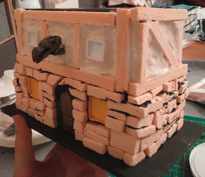
View from the other side. I used my fingers to apply most of it, then a wet brush to fill the corners. That's also when I realized a flaw in my hasty timber construction around the house angles. Let's say it's some fantasy interpretation, because otherwise the way this house is built doesn't make sense.
Painting
Once dry the filling paste sagged and crackled a little. I also painted the bottom stone with what I thought was a very dark blue, but it turned out to be lighter than expected and didn't look like stone at all.
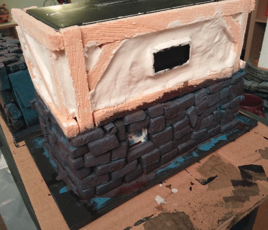
I applied a very dark brown was on the stone to try to fix the blue effect.

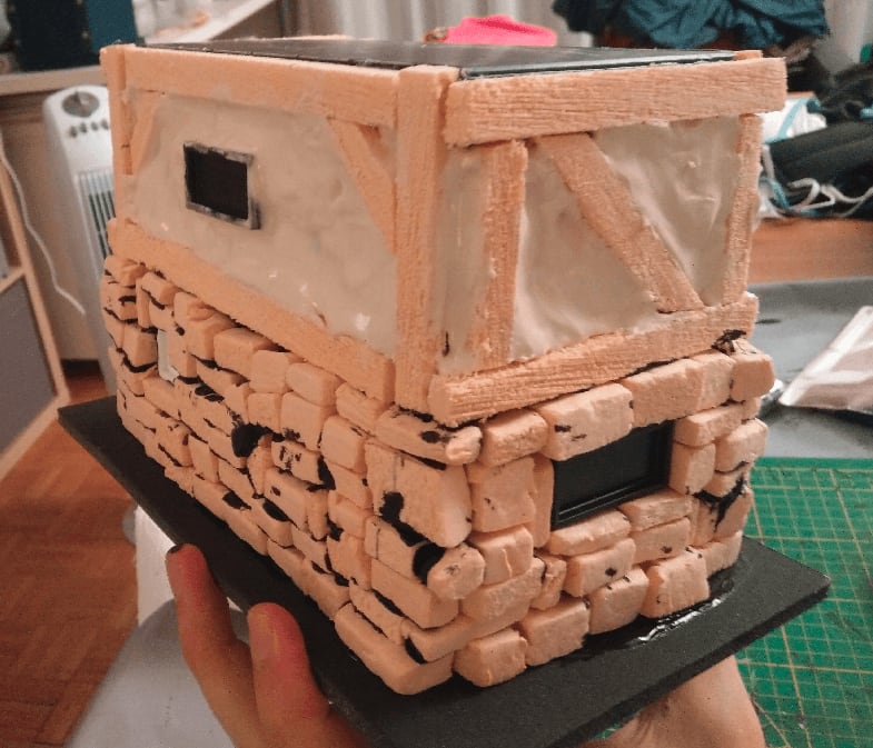
With a grey drybrush on top, it looks acceptable. You can see spot some traces of blue here and there, but the overall effect is saved.
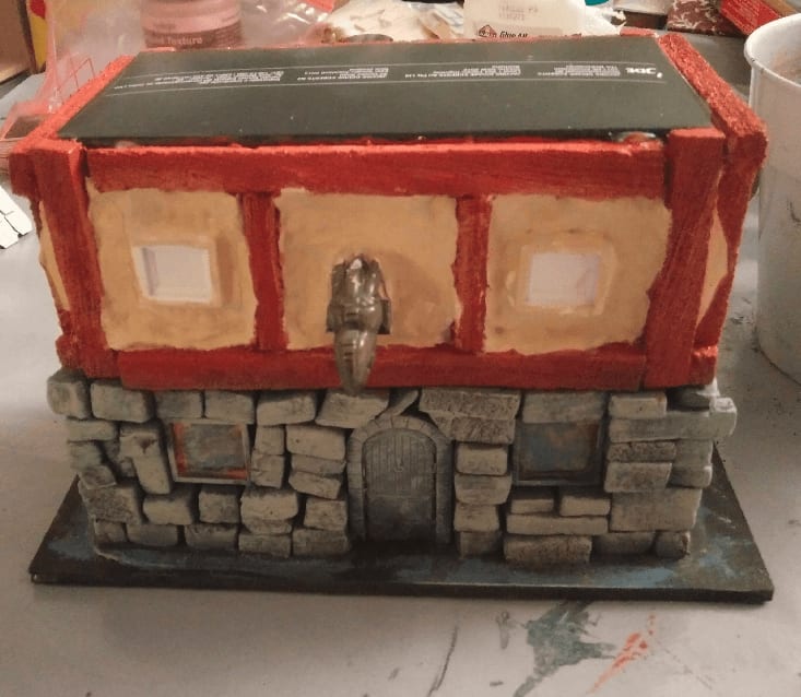
Now painting the top floor. Brown on the wood, tan on the filling.
Same behind. Also painted some stones in various shades for variety.
Brown wash on the filling on the first floor. I expected it to go in the recesses and give some depth to it, but I let it to dry with the house sitting up, so all the wash pooled at the bottom. I should have left the house to dry horizontally, with the side I washed facing up. But hey, I didn't.
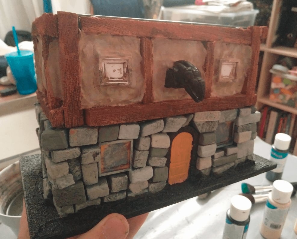
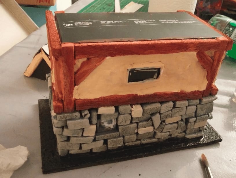
I drybrushed the top floor with the tan color I used for the first coat, and it saved the effect.

The drybrush also made the sloppy wood paintjob and filling more apparent, though.
Windows
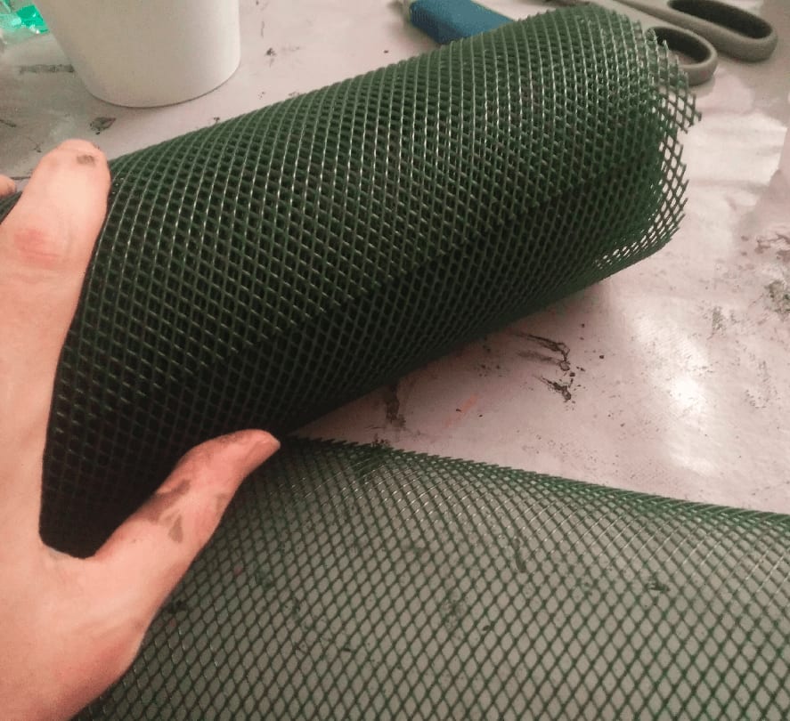
For the windows, I used this gardening mesh thing.

Cut them into the dimensions of my windows.

And glued them in the windows. I used some golden paper (packaging from a cake I bought) as the background, to make it look like there is light inside.
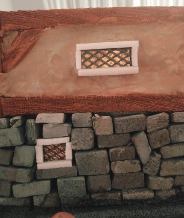
I started adding wooden frame with matches around the windows, but soon realized it was quicker to made them from textured foam. I cut fine strips of foam, and applied wooden texture with my metal brush. Once painted this actually look more like wood than actual wooden matches.
The frame on the front are a big large, though.
Painting the frames with a lighter brown color. I wanted to differentiate them from the timbers.
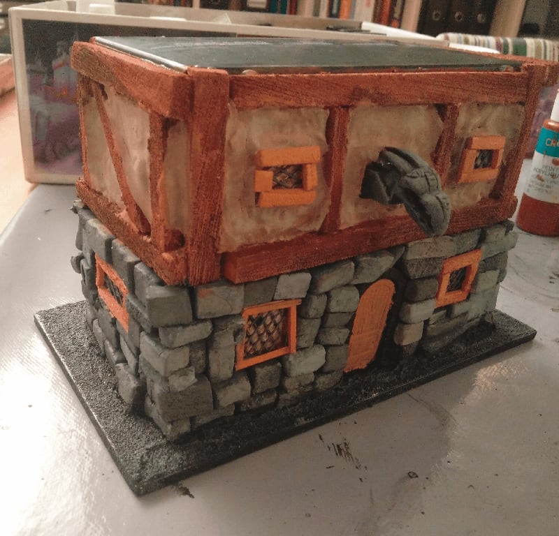
Roof
Now, let's work on the roof. Cardboard folded in half, and foamcore triangle support.
I cut lots of cardboard shingles. Actually much more than what is in the picture.
Glued them on the roof, again using my black paint + mod podge mix as glue. This had the added advantage of also covering the initial cardboard with black, covering in darkness any spot left between shingles.
I added more timber on the ends, using pins to keep them in place.
For the windows, I used some cheese packaging.
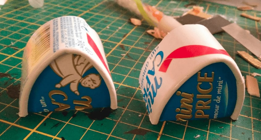
Once cut, they have the perfect shape.
Once again, trash recycling to the rescue.
This is what the roof looks like with the windows added. Glueing those shingles around the round windows was tedious.

I then started painting. Initial black coat of mod podge and black paint. My mod podge was quite old and some parts of the glue had started to solidifying, which turn out to be for the best as it gave the mix a grime texture that works well on those shingles.
I applied three drybrushes: deep red, red and orange.
Final shot
And the final shot, with flocking added. I kinda like the protruding window effect, but I don't think the mesh works well on those windows. I will have to revisit that in a later build.
I learned quite a bit in this build:
- Don't paint stone in dark blue
- Filling paste cracks and sags a lot
- Timber corners should be made with one large piece, not two smalls
- Roof should be larger than the house
Ice Cream Box Stairs

Some giant stairs that may lead to a forgotten necropolis of some kind.
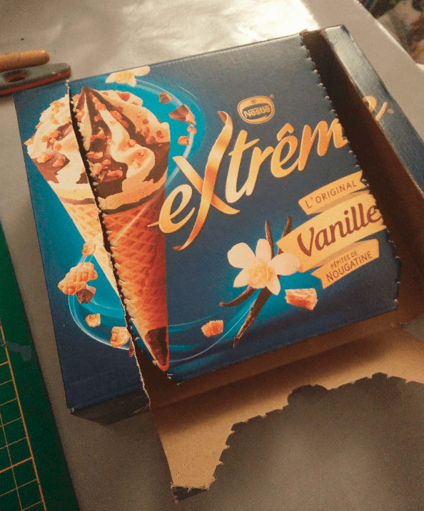
It all started with this box. I was about to throw it away last summer and the way the central part as forming a slope in the middle made me realize it had an interesting shape for a large set of stairs.
I added blocks of foam on each side. My cut was not very precise so the blocks didn't have the perfect dimensions. I added wood glue at the top and bottom, but also added some pins on the top to force the foam block to adhere to the cardboard (I knew I would be covering those parts with bricks later, so I actually never removed the pins).
Some rough ramps in the inside to guide the cardboard. Without those, I was afraid the cardboard would just sag.

Gluing and pinning the bottom part as well, to give more stability to the build.
Some heavy bits of metal glued at the bottom (with hot glue this time, I don't trust wood glue for something that heavy) to give more weight to the build. This will be all cardboard and foam, so the end result will be pretty lightweight, the addition weight will give this more stability.
I then cut squares in my foam board, and then cut them diagonally in half. This gave me a lot of 45° angled rocks that I then positioned on the slope (I didn't glue them at that stage, I was just going to the overall feel). My cuts where definitely not precises, but I didn't care because I was looking for this crumbled look.
At some point I hesitated into making smaller stairs, to give this a more realistic look at scale with the minis, but this would have been unplayable, and I still want my minis to be able to fit on the stairs, so I went with this cartoonish size.
Next was drawing some stone shapes with a ballpoint pen on them.
Then enlarging the grooves with a utility knife and a mechanical pencil, and applying stone texture with an ball of aluminum foil.
Now I can glue them on.
I then applied black wood glue on one side to cover the stairs an wall, and while the glue was still wet, I added lots of bricks on the side.
Did the same thing on the other side, and applied more black glue to the first side.
Continued this until the whole structure was covered in black. This took quite some time as I had to wait until one side was dry to paint the other side.
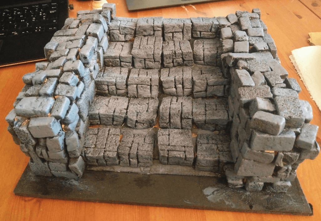
Then drybrushed everything in gray. This is the usual step when everything starts to come together.
I tried to paint some stones in different shades of gray, but the nuances were so subtles that I can't even tell which I painted or not. I learned to be more drastic in my color choices at that step; because everything will get another drybrush and black wash afterwards, I can pick much vibrant colors.
With a wash applied. The picture made it look like much red than it was in real life.
The various shades seem to get through on the sides here, though.
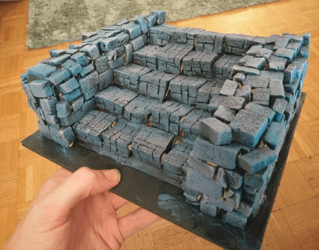
And one last gray drybrush.
I glued some plastic squares I got from I don't even remember where, to act as stones.
Then covered it all with watered down glue an was ready to sprinkle dirt and flocking on it.
And the view after the flocking. It was one of the first time I added flocking to a piece that large and I was impressed by how much it made it come to life. I guess when it sees those green parts, our brain automatically registers a sense of scale and time of what it represents.
And the final shot. I should have added a mini, for scale, but basically you can fit 4 minis per level.
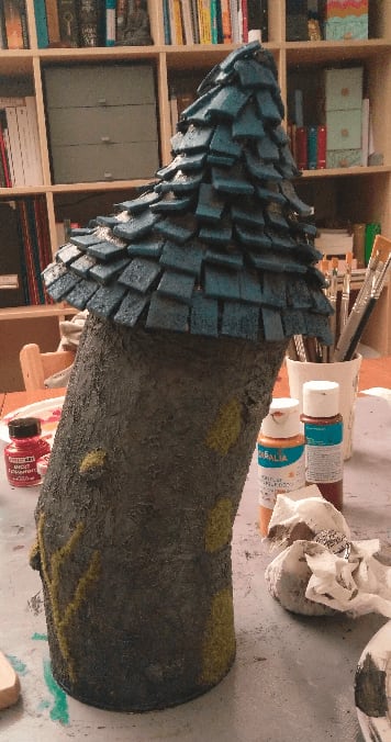
Yoghut

This is a hut, made from a yogurt. So, a yoghut.
I started with an empty yogurt glued to a plastic lid. I traced a rough circular shape with a sharpie around it, and cut it with scissors. This was meant to give it some stability on the table.
I then took a bunch of wood sticks (the one you find in ice creams) and craved grooves in them with a utility knife. This was very long to do, and since then I found a much faster way using a screwdriver.
I cut them in different sizes so it won't seem too uniform.
I glued a some together to form a boarded up door.
And glued all that on the initial yogurt. The door was glued in the inside of the yogurt while the other boards were glued on the outside.
I trimmed the top of the planks so they would all have the same height.
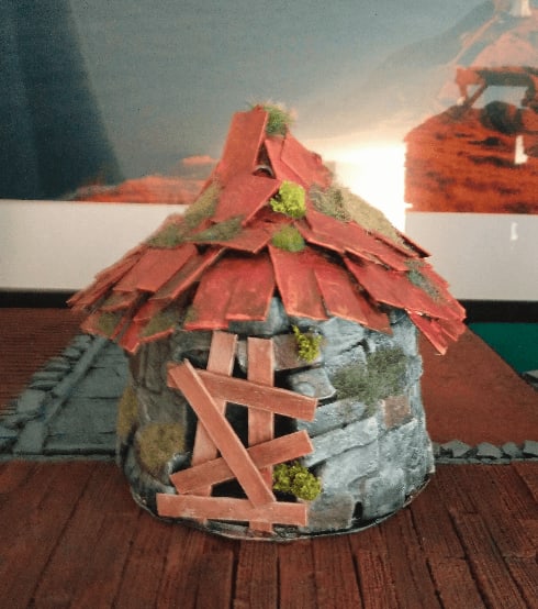
After that I wasn't really sure how to finish the roof. At first I wanted to create something mossy, with tree branches and leaves everywhere, like a hag hut, but had no idea how to do that.
This project stayed in that state on my shelf for several months because I had no idea how to finish it. And one night, I decided to give it a try and see how it would turn out.
So I started with gluing a rough foam part on the top, to give it more volume.
Then I soaked a few paper tissue in a mix of water and wood glue and applied that on the top. I let it dry overnight.
I painted it with a old pink/beige color that would serve as a basis for a future wash.
I then applied wood varnish directly on the piece, wood and roof. To be honest, I still don't know myself what the roof is supposed to be made of. I ended up adding flocking, the magic ingredient that make any craft piece 20% better.
Simple pillars
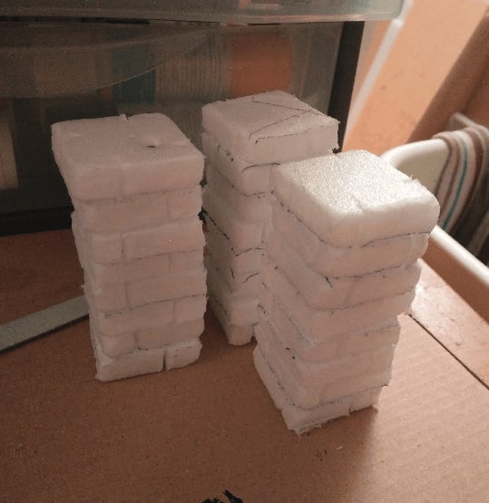
With the excess foam from my previous project, I started crafting some pillars. Once again, they are heavily inspired by Black Magic Craft.
I stack them four by four and put a nail in the middle of the stacks. This allowed me to bind them together nicely, and also gave some weight to the build.
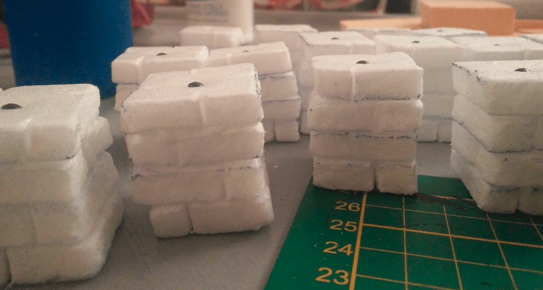
I will then glue two stacks together on top of each other for a complete pillar.
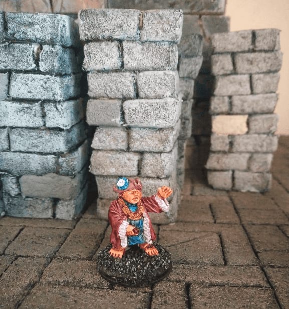
Here is what they look like once painted. This was a messy dry brush of light gray on the stone.
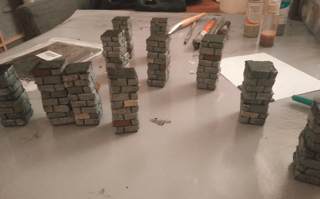
I painted a few stones in various colors for variety.
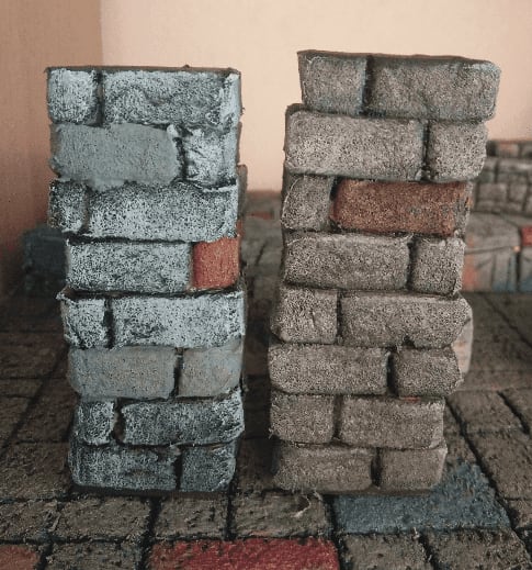
I tried a brown wash on them. On the left is before the wash, on the right after it. It certainly tied the whole pillar together in the same color space, but it toned down some of the colors so much that I wondered if it was worth the time painting those bricks in various shades of gray in the end.
And for scale, with some other minis and other fun foam stuff I was messing around with at that time.
Black Magic Craft Tower
This is heavily inspired by the modular mage tower build by Black Magic Craft.
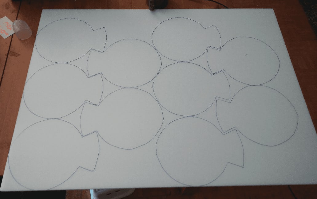
Draw the same shape over and over again on a large sheet of foam.
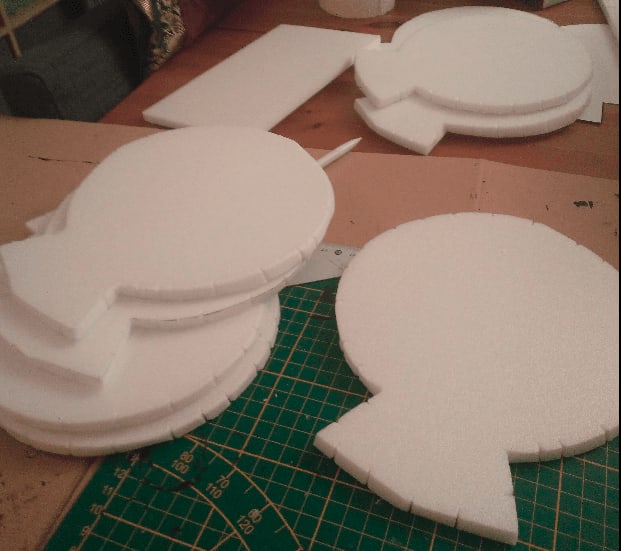
Use a utility knife to cut those shapes out, and draw irregular stone patterns on the sides.
Glue them all on top of each other at an angle to make create a stair effect.
Once stacked, and with a stone pattern drawn on it. I wasn't really sure what to draw on the top floor, so I went with a star pattern with alternating stone size.
The usual mix of black paint and mod podge to both seal and act as a basecoat.
Grey overbrush on the stone, and tried another stone color on top.
I painted a few stones in different colors to break the monotony, but they came out a lot lighter than expected and I was afraid it would look too distracting.
I applied a black wash on the grey stones, and it toned it down enough for my taste. I then started painting the top stones in various colors that I thought would go well together (dark red, brown and tan) but it just made the whole piece look like a giant chocolate cake.
Well, this was a fun build and pretty easy to do. I should have applied the stone texture (through the ball of aluminium foil) before glueing the pieces together, though.
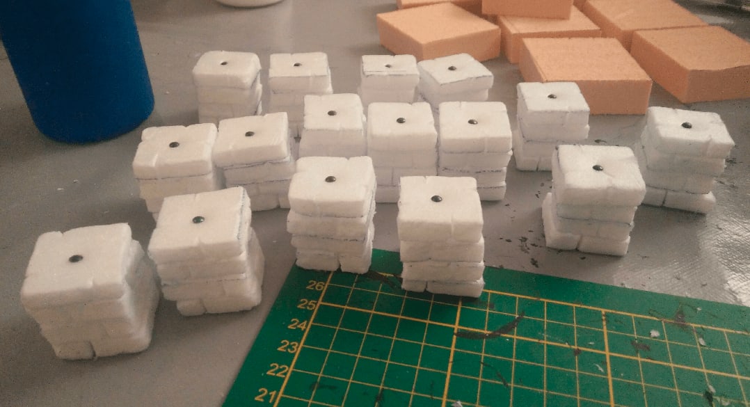
After I finished the build I decided that I should made a few others, so I could stack them to build a really high tower. I also decided that I should add a custom top level on each side, allowing more more versatility on what the last floor would look like.

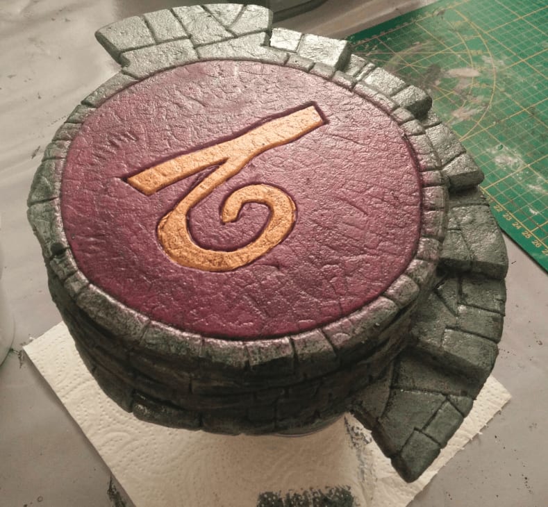
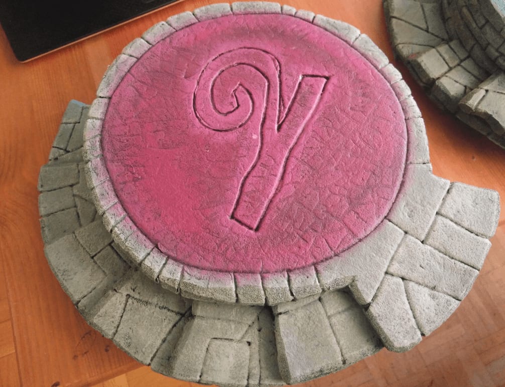
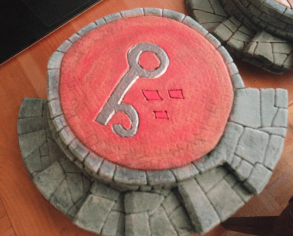
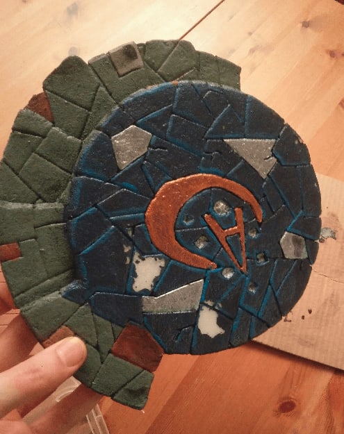
I took inspiration from the winds of magic of the Warhammer world, and decided to build one tower top for each wind.
I created two more towers.
The same but face down (or up, or whatever).
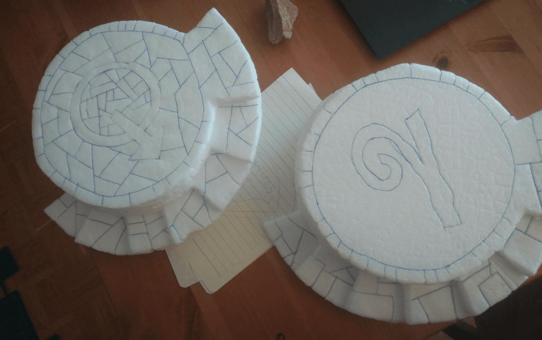
Some closeup of the hand drawn runess
Here it is, after the first coat of paint.
And the view from the other side
I tried drybrushing some brown and green here and there to give it a rough and used look.
The final effect is ok, but I think I might have had to add some color variety to the stones before doing all this colorful drybrushes.
I tried again on the next part, again with the green and brown on top of gray stone.

And first layer of colored paint on top. The stone pattern on the top floor was done using a GreenStuffWorld roller I just received and wanted to test.
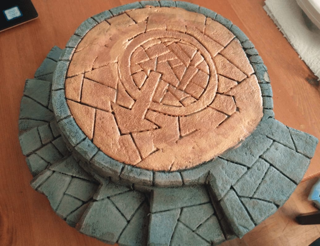
For this one, I went all gold on the top.
The purple wind. I tried some kind of light aura effect around the rune.
I don't really know what I did there, but it was a mistake. I think I tried to apply a red wash, or a red drybrush, but it just ruined the initial effect that was so much better.
Finally, it was time to paint the runes and apply a wash on the tops. This took quite some time as I had to first wait for the rune paint to dry before applying the wash (I'm using cheap craft paints, and if I try applying a wash before it's completely dry, it just removes the paint). Also, because the surfaces to paint are on both sides, I had to wait for one face to be done before moving to the opposite face.
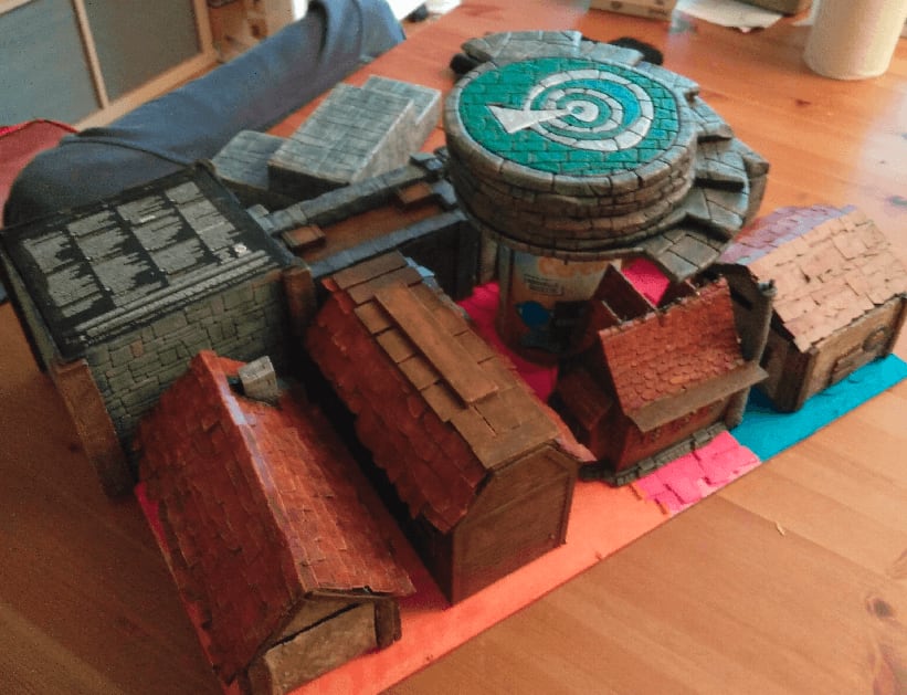
With the other projects I was working on at that time.
I had some issues while having them dry, I accidentally left a sheet of paper on top and the still wet wash adhered to the paper and ripped the paint off.
Unfortunately, I don't have a group picture of all the tower parts because I was putting them in boxes (I'll be moving to a new house soon) as they were finished.
Magnetic Sewer Tiles
I'm a sucker for magnetic terrain. I'd love my dungeon tiles to automatically click to each other when they come near. I haven't found a reliable way to do that yet, but I decided to take the opportunity of crafting sewers tiles to give it another go.
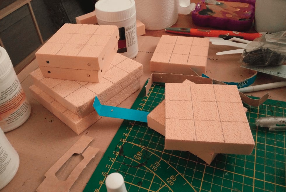
I went with 3x3 tiles, so I could carve the sewer in the middle.
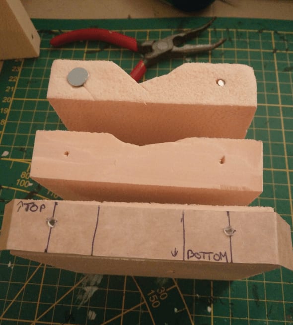
I drilled small holes with an knife halfway in the width and height of the right and left squares. To make sure I always drilled at the same spot I made a quick cardboard helper. I then added a small neodymium magnet in the right hole and a screw with a large head in the left one.
By putting the screw always on the left and the magnet always on the right I'm sure that no matter how I organize my tiles, I'll always have a magnet in front of a screw. I could have put magnets everywhere but then I would have had to worry about polarity (to make sure they were attracting, not repulsing each other).
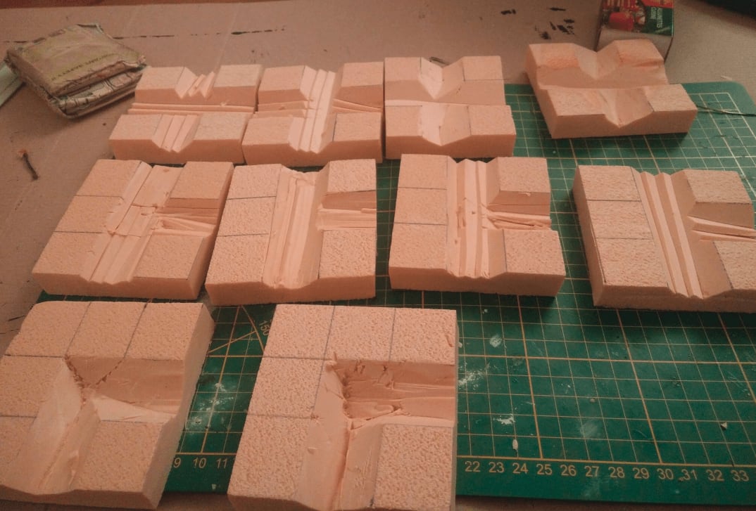
I tried various ways of carving the inner sewer part. I tried cutting small lines of foam, or larger ones. In the end I went with cutting 4 small lines as it was very fast and I plan to fill the sewer line with modeling paste anyway.
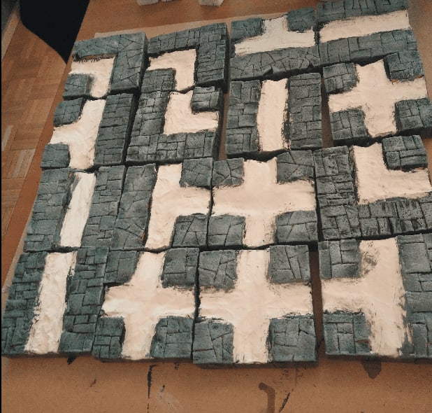
I added some stone pattern on the sidewalks with the usual pen and utility knife technique.
I decided to change the flag stone pattern on some tiles by not using only straight lines and I'm glad I did because I like the way this turned out.
I was out of magnets and my order didn't arrive yet, so I could only add the screws and store those babies on the shelf for a few weeks.
Once my order of magnets arrived, I added them in the holes. I then covered the sides with black-tainted wood glue (two layers) to protect them and keep the magnets in place. Without this protection I was afraid they would get out of the holes I drilled and stay connected to the nails on the other tiles.
Then it was time to fill the canals with filling paste. The paste cracked when drying in a few spots, though.
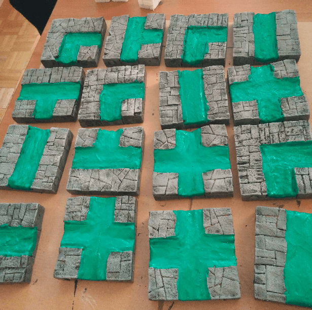
This is the complete set with painted sidewalks. I used magnetic paint here, as an experiment. It protects the foam from scratches and is already black so this has pretty much the same effect as the usual black wood glue; and I had a can laying around. It is also quite heavy, so this was giving some weight to the tiles, which is always a good thing.
Gray drybrush. I might have overdone this one layer though.
Second, slightly lighter, layer. I really like the irregular stone pattern better than the regular one. It's also much faster to draw.
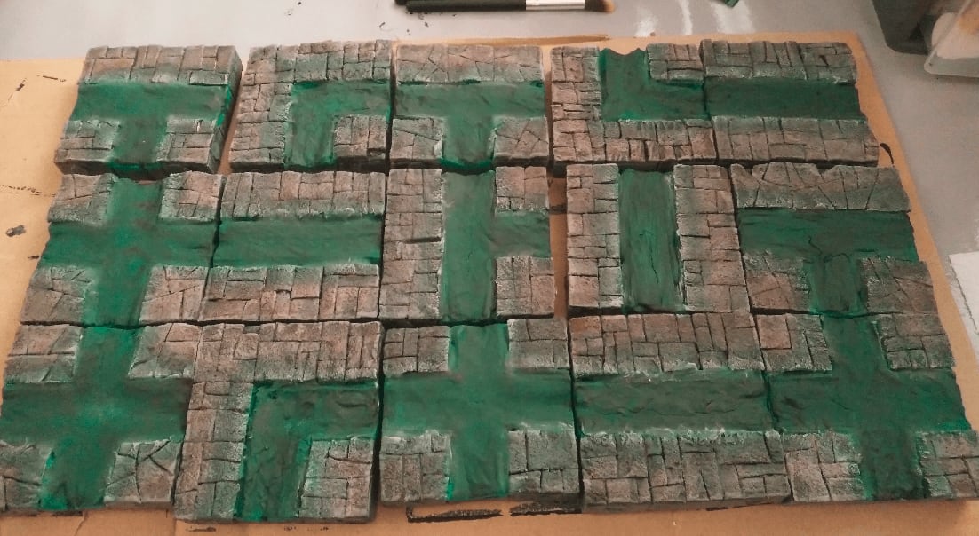
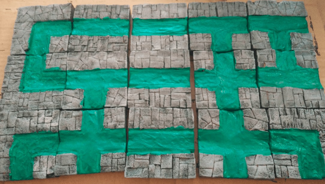
First coat of green paint, taking care to also paint the edges, so it really looks like there is some depth when looking at them from the side.
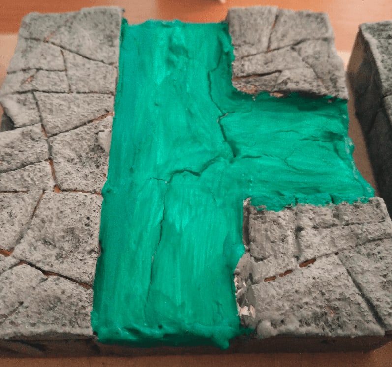
The cracks are really showing here. I should have fixed it by applying a second layer of paste before painting.
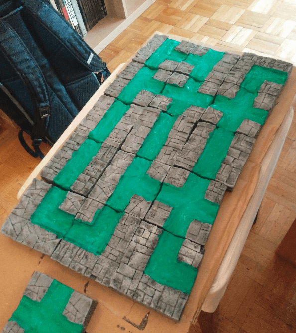
The overall effect looks great though. Some of my tiles are not perfectly square, and even if they still click together correctly two at a time, when building a whole board like here you can see that they start to not align properly. Magnetic terrain is tricky, I think it only really make sense when you can cut perfect shapes in a consistent way; and as I don't own one of those fancy Proxon wire cutter tables, I guess I won't be able to achieve that level of consistency.
To fix the cracking issues, I added another layer of matte gel on the canals. This had the double benefit of masking the cracks, and adding some undulating effect that might look a bit like ripple (with a great dose of imagination).
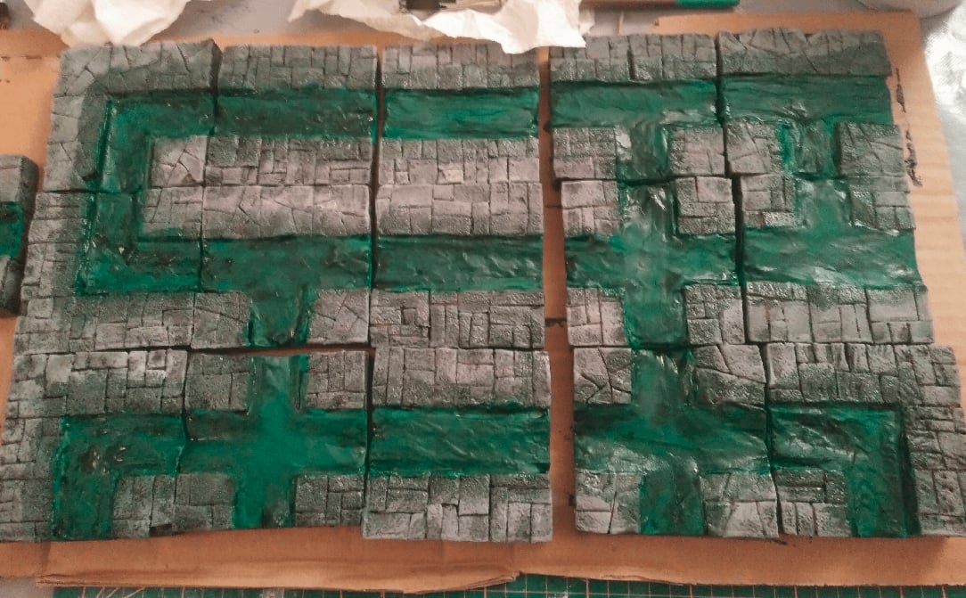
I then added a dark green wash on the canals and a bit on the sidewalk. The result is... messy. I was a bit disapointed at this stage, thinking I had ruined everything.
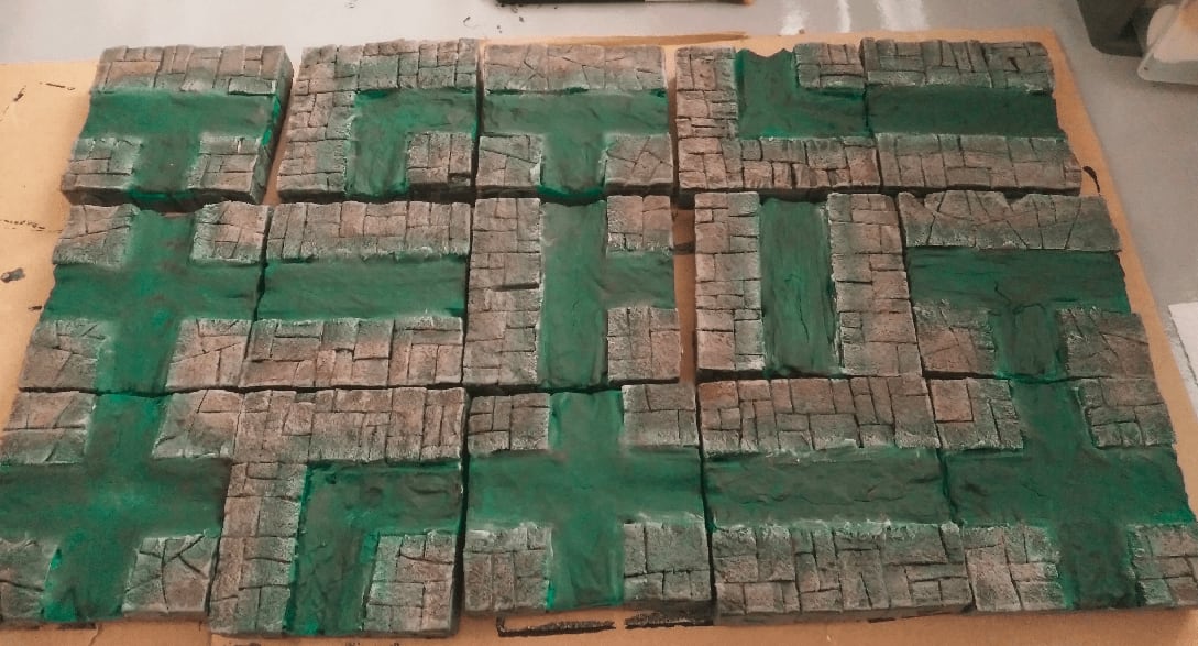
So I applied another dark red was on the inner parts of the sidewalks, and finished with another light drybrush of light gray on top to blend the two.
And here they are, some sewer tiles for when my players want to chase a mutated goblin that escaped from a carnival. All great stories start like this.
Some more shots of the tiles with some minis for scale: